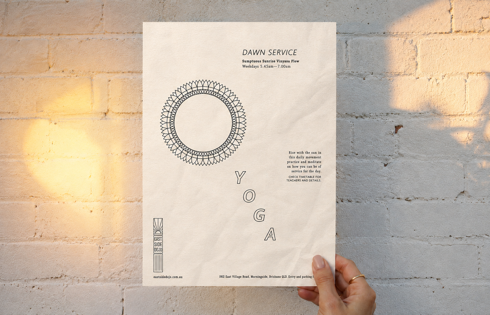
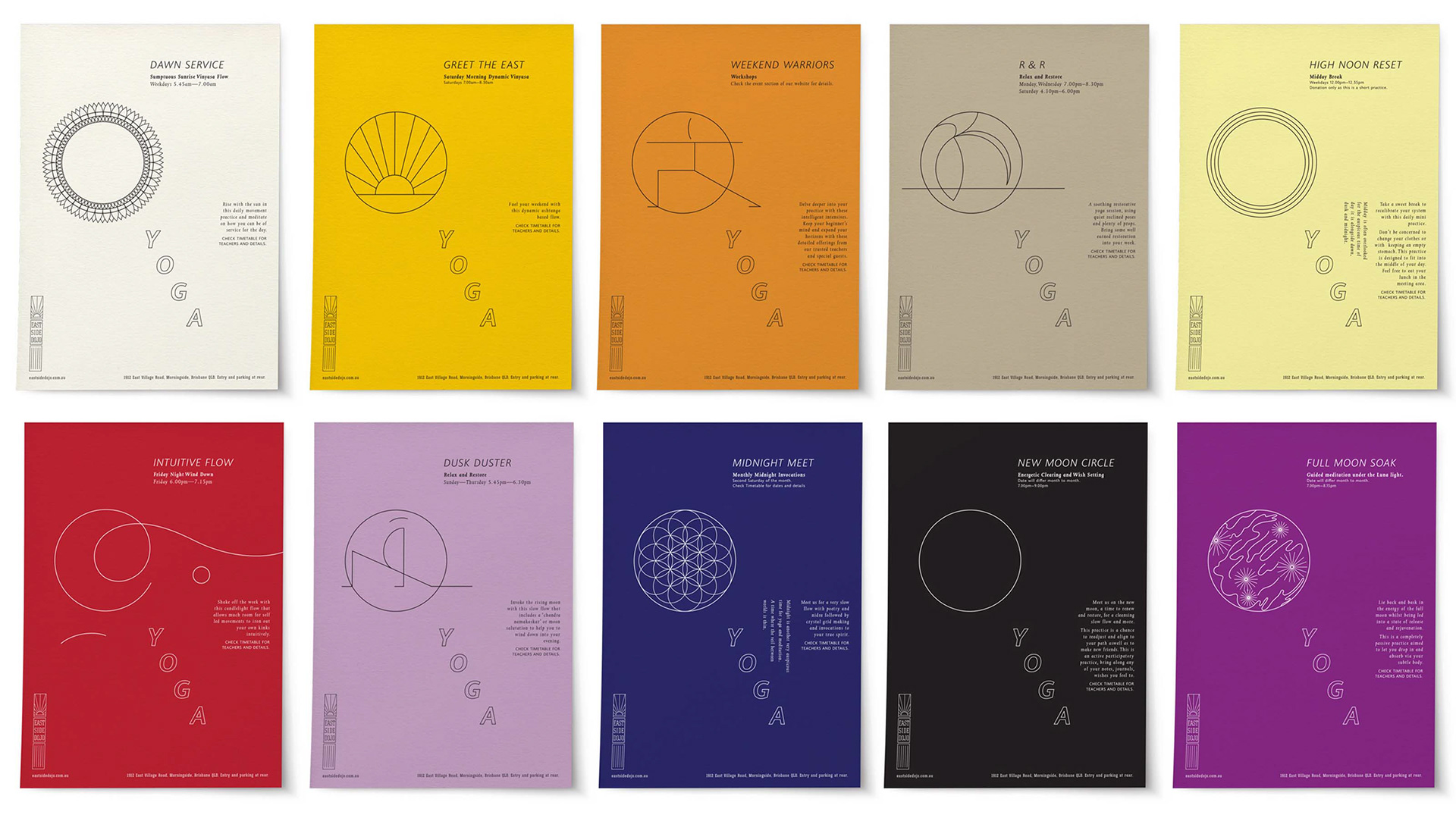
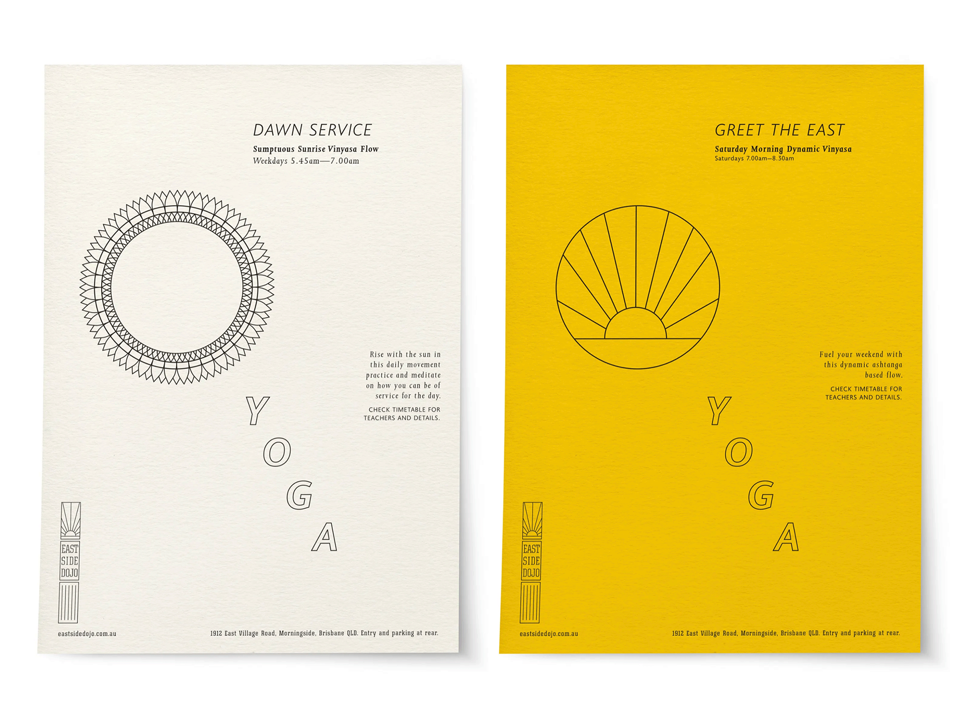
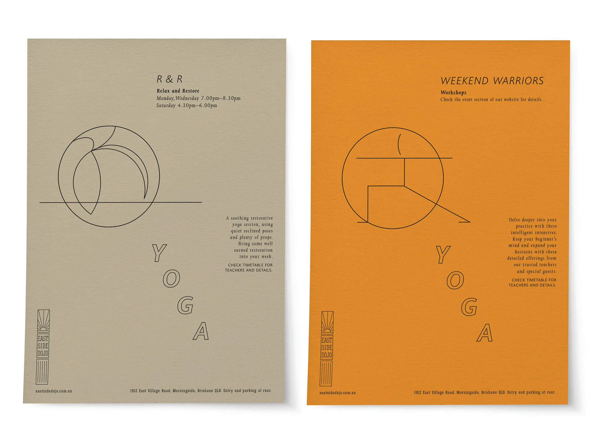
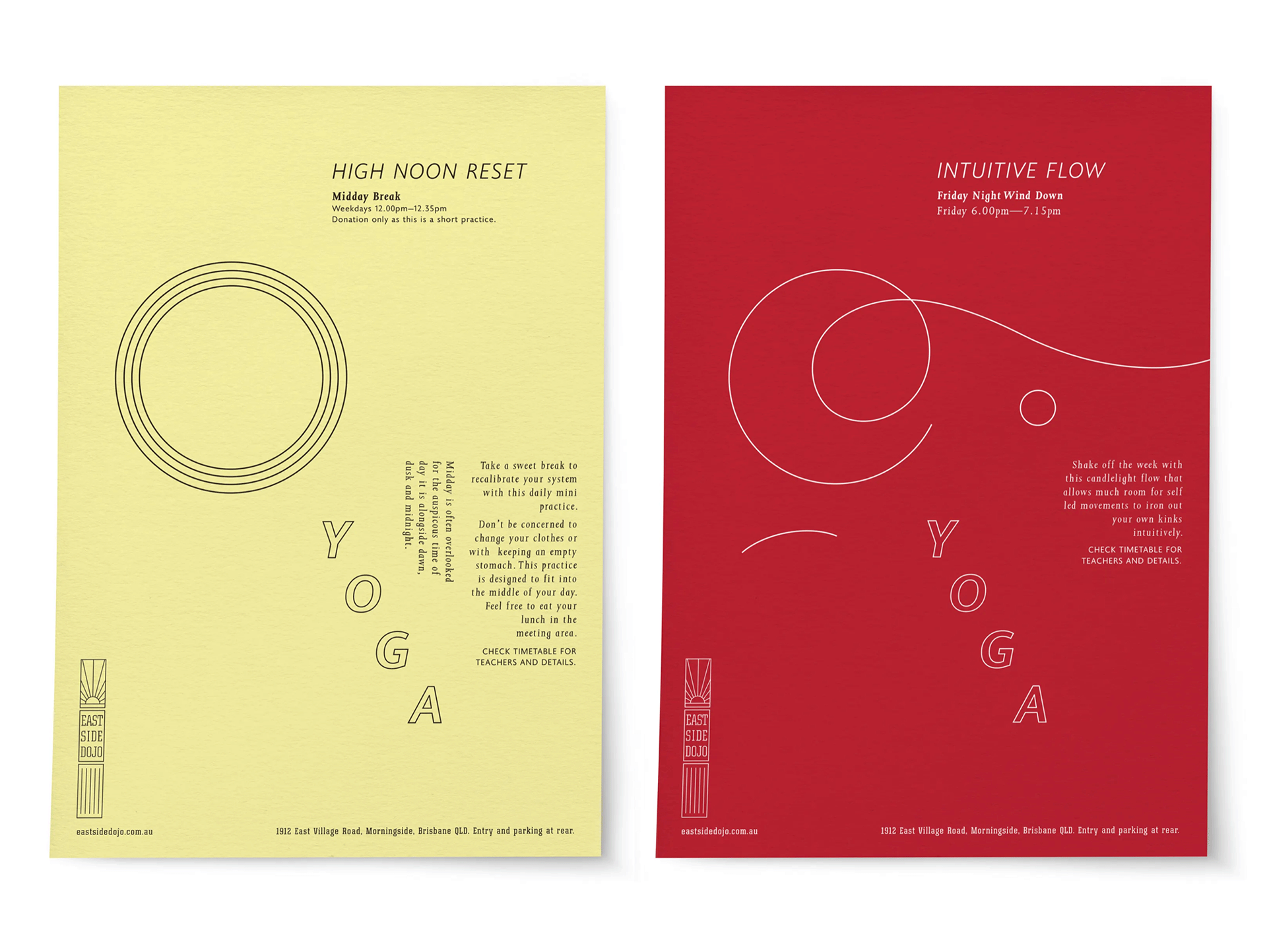

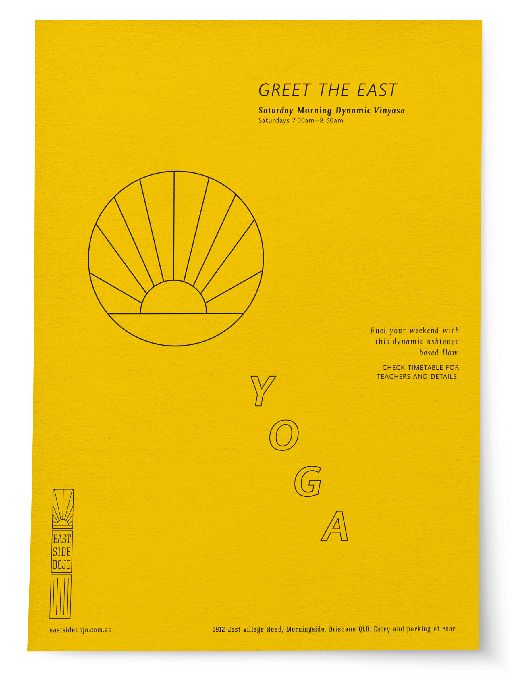
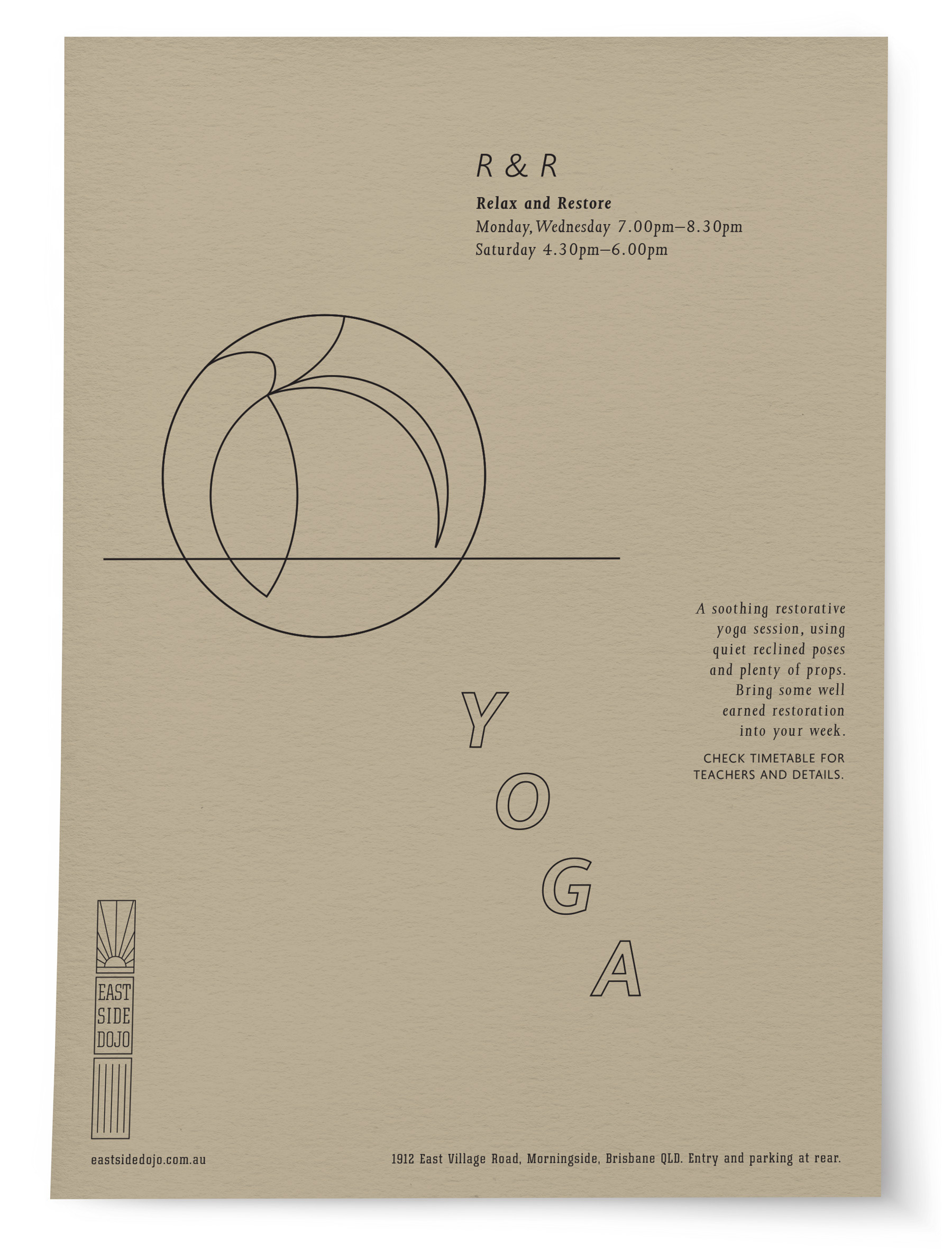
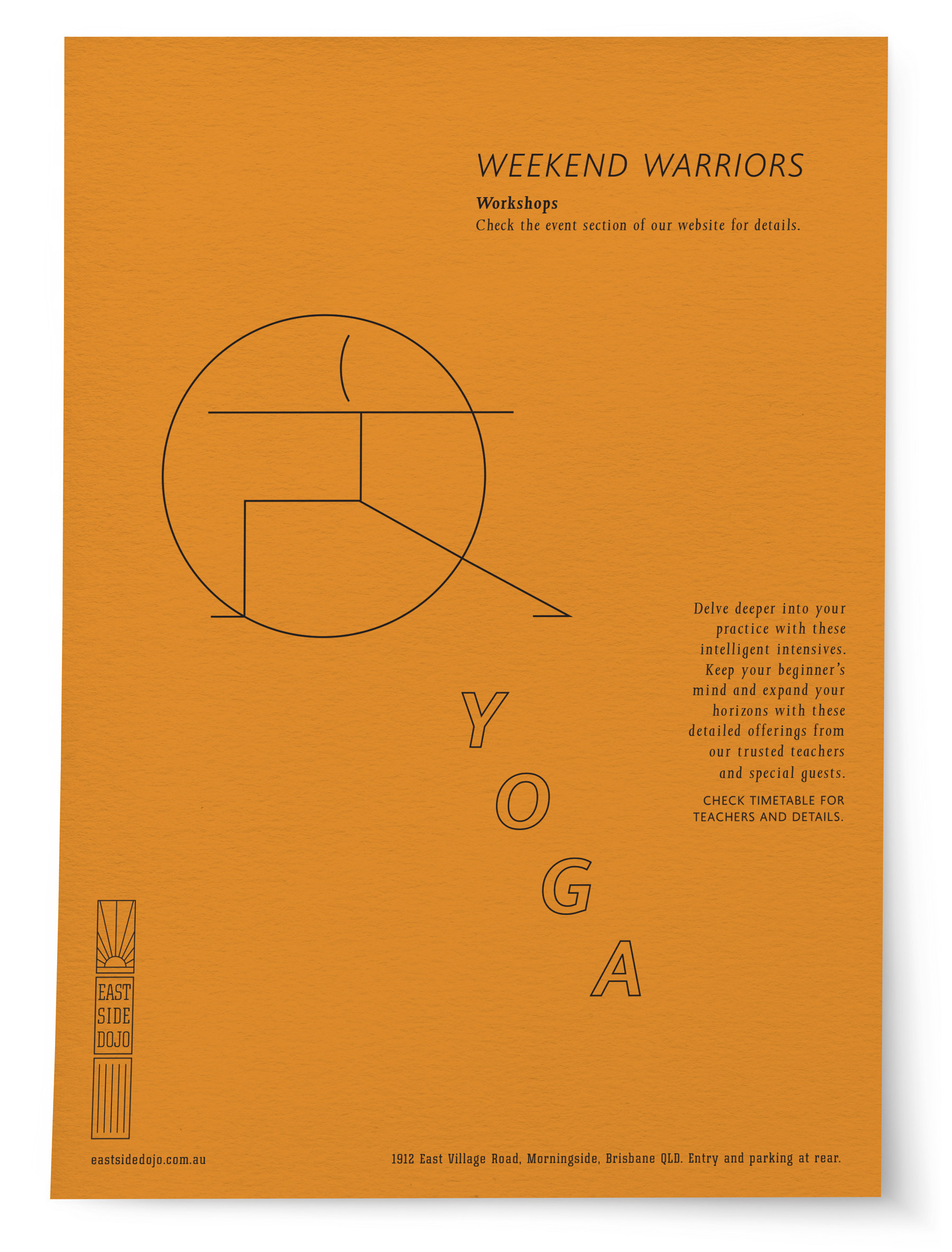
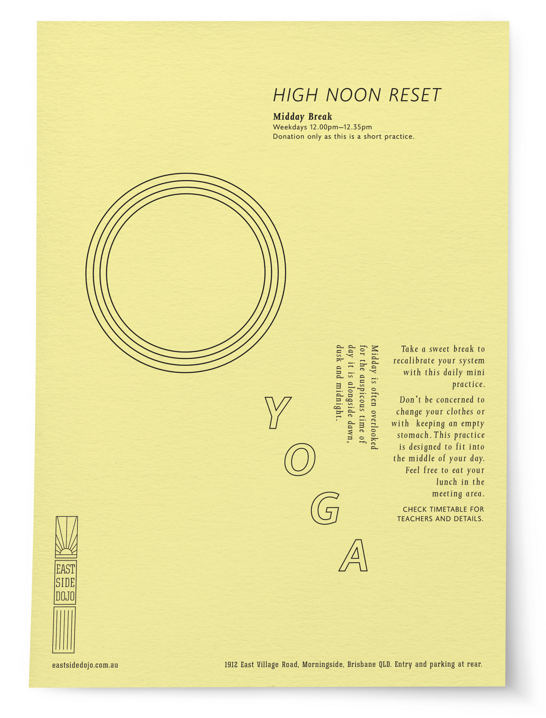
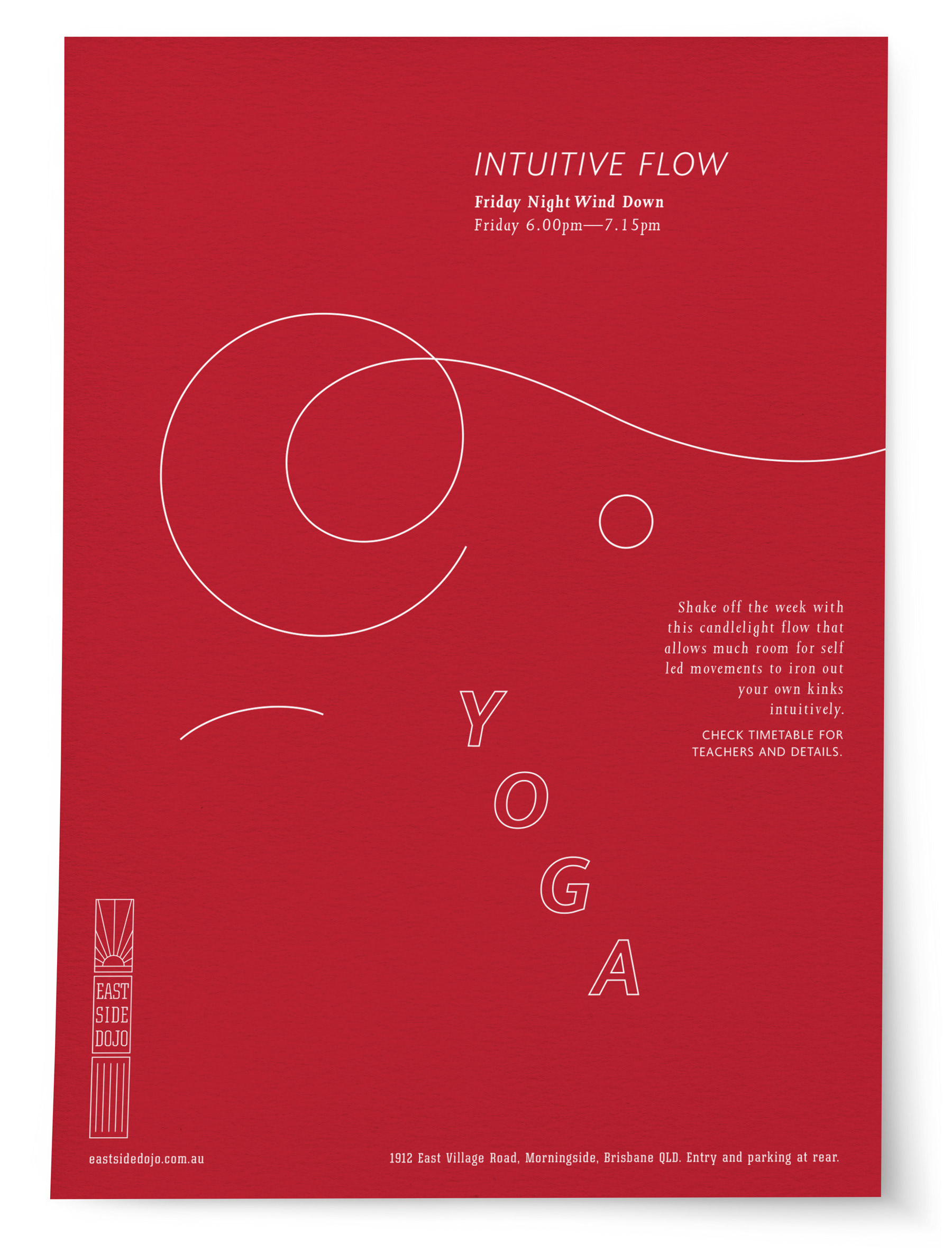
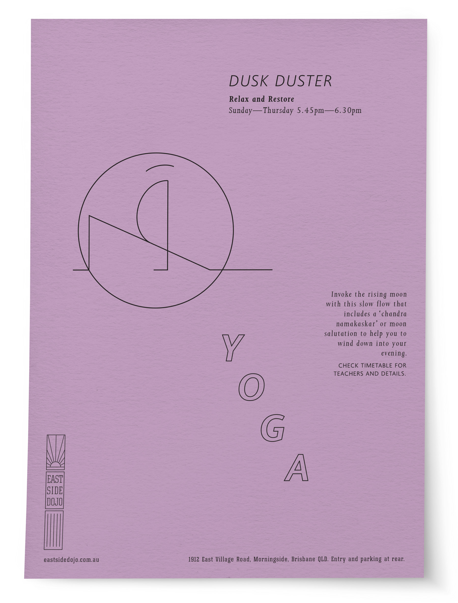
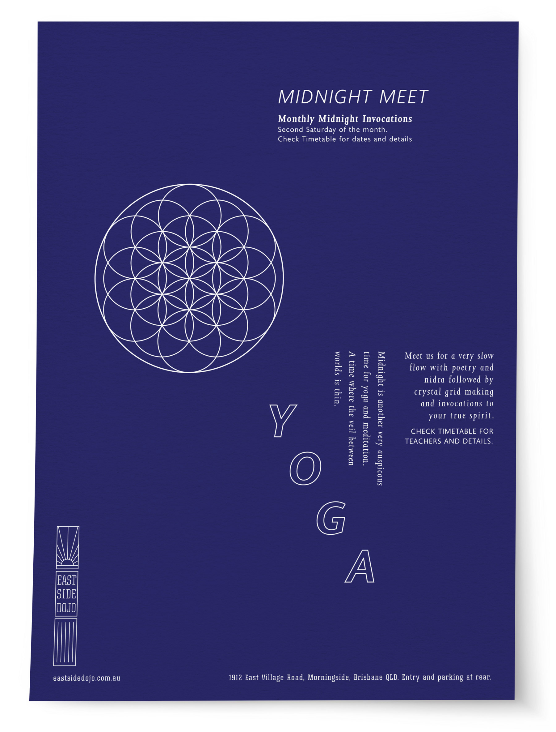

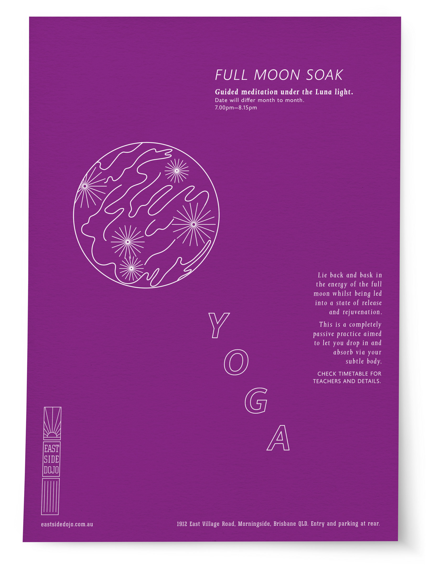
A self-initiated design exercise exploring a visual system for a fictional series of yoga classes. Each class was given its own name, copy and reductive linear illustration, creating a family of distinct but related A4 flyers. The illustrations translate the character of each practice into simple graphic forms, while a consistent typographic structure holds the series together. Designed around single-colour artwork and the vibrant palette of G.F Smith Colorplan paper stocks, allowing colour, line and typography to do the work.