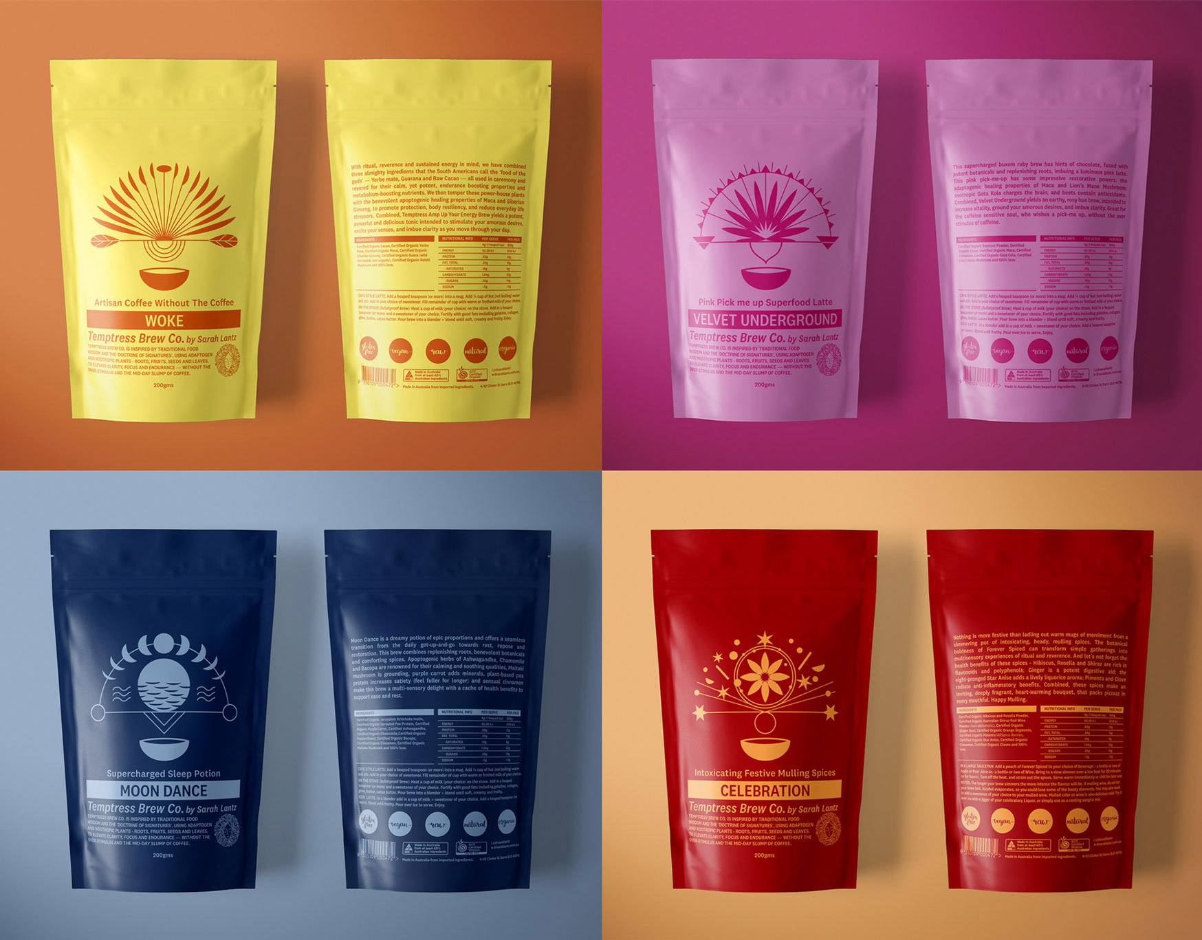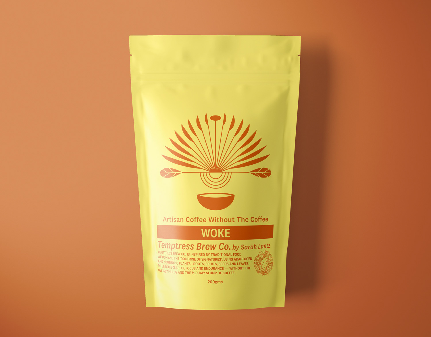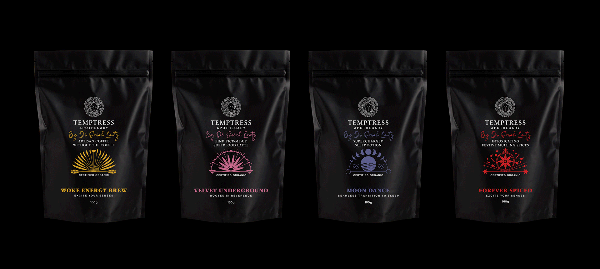
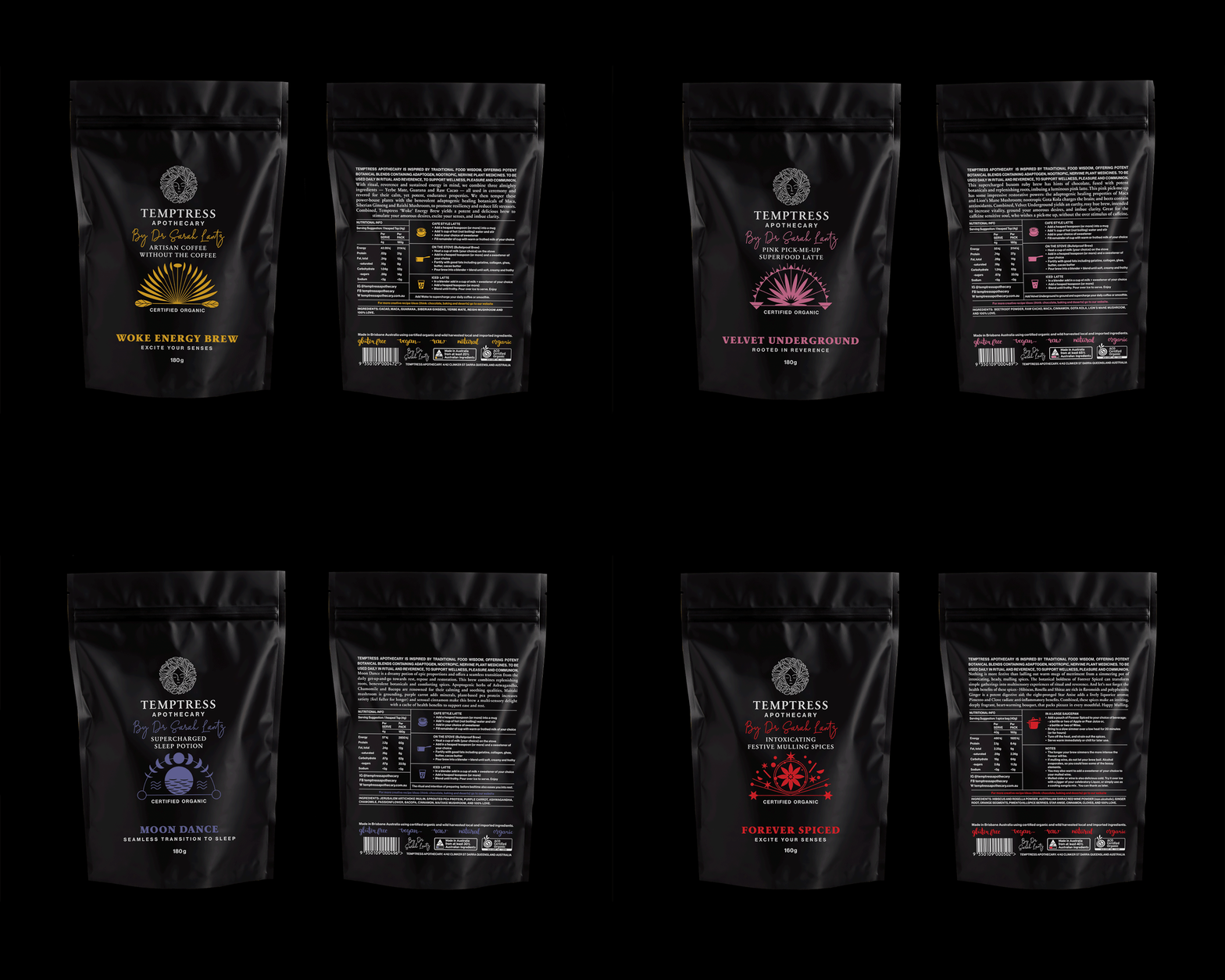
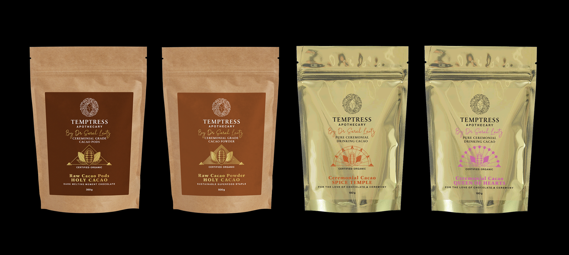
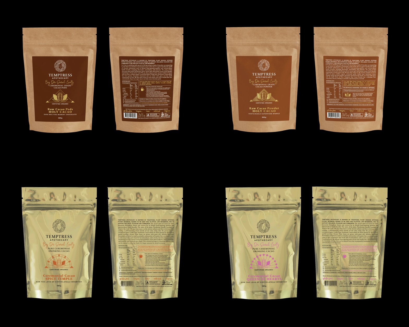
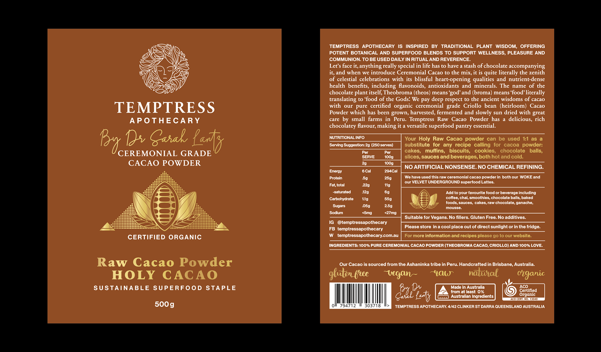
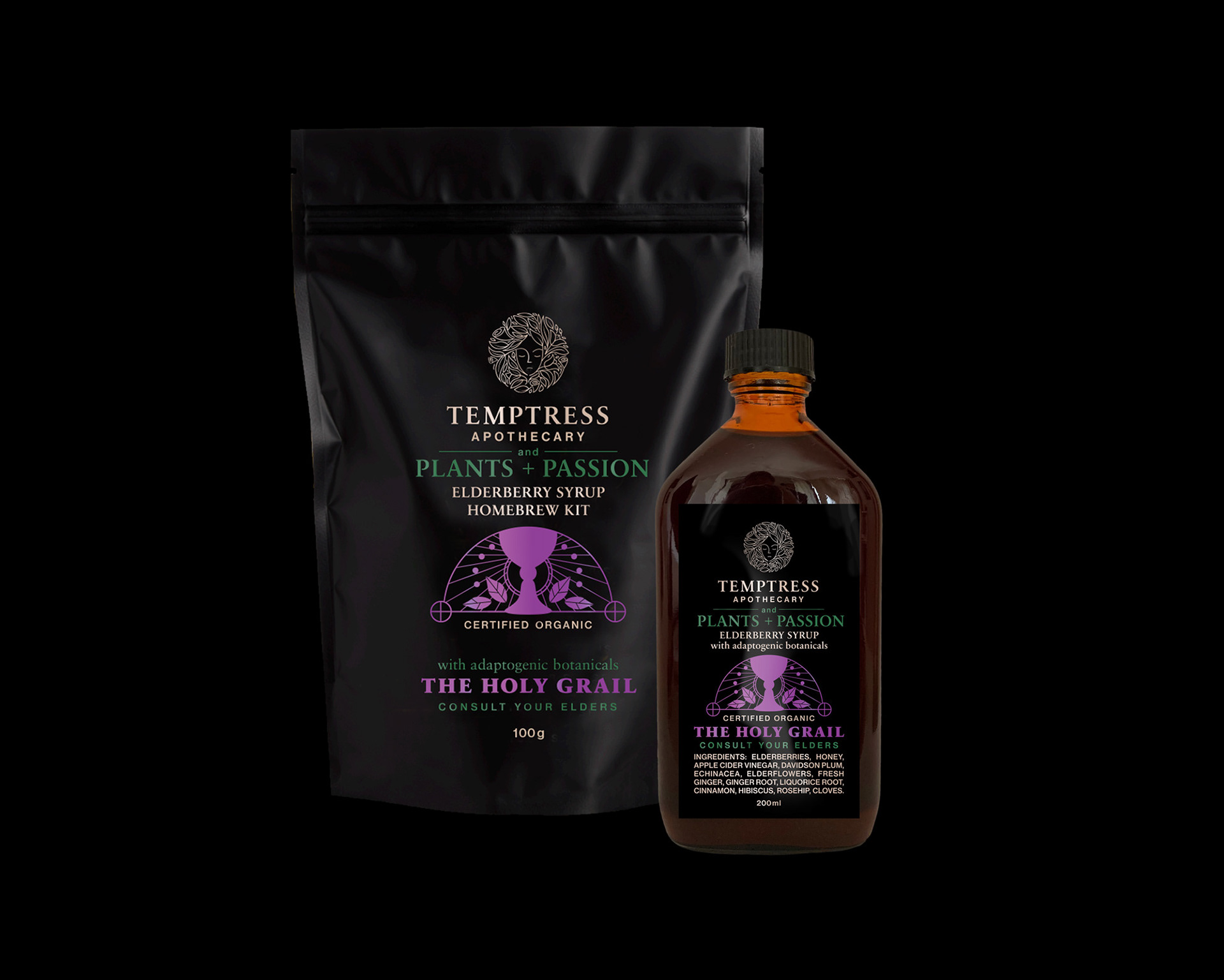
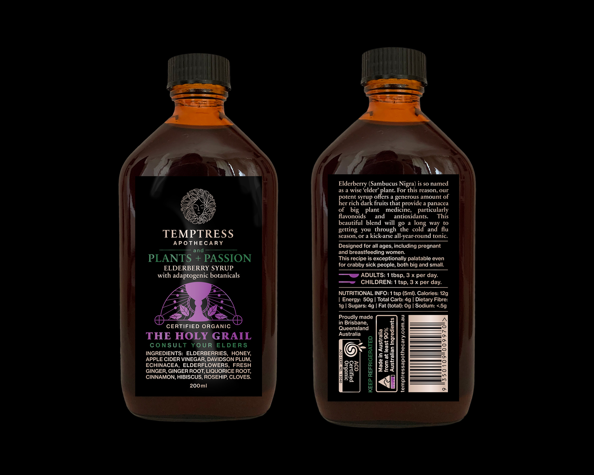
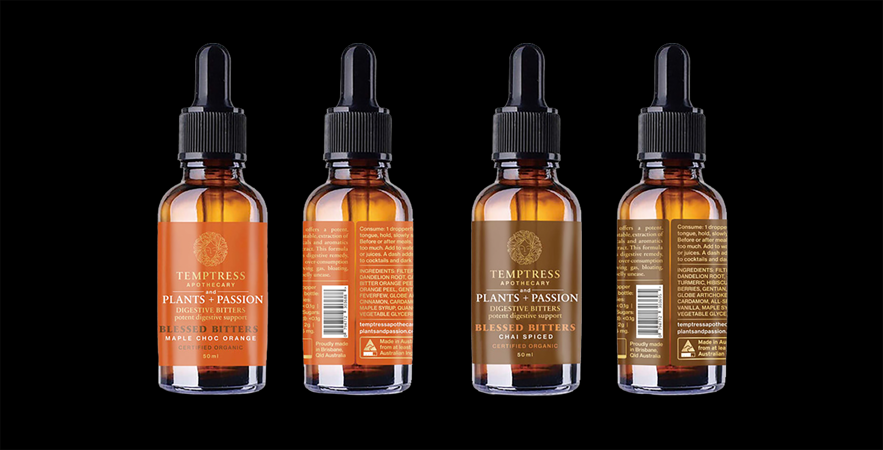
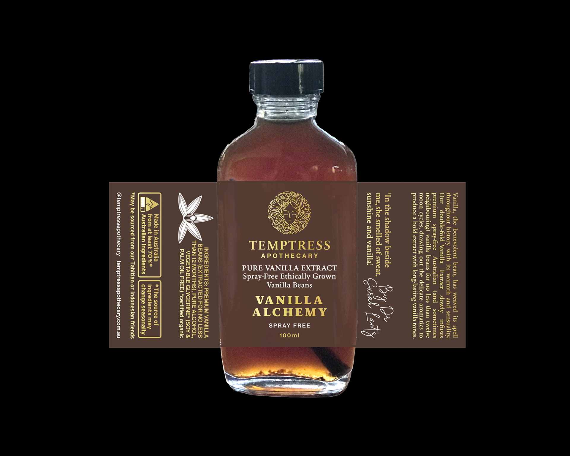
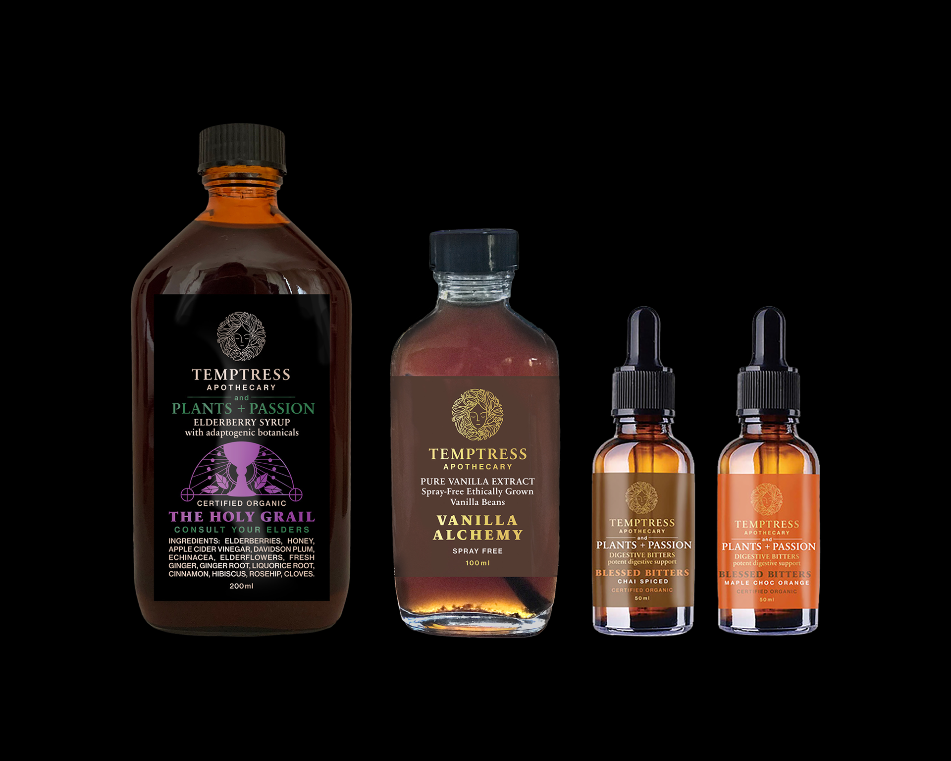
An ongoing packaging project for Temptress Apothecary, developed across an expanding range of botanical drinks, cacao products, herbal blends and bitters. Working within the brand’s existing identity and logo, I developed a packaging system that could accommodate very different products and formats while retaining a recognisable visual language across the range. The existing typographic language was refined for greater flexibility and legibility, alongside a family of detailed symbolic illustrations developed for the individual blends, drawing on their ingredients, purpose and ritual associations. Colour and recurring graphic motifs gave each product its own character while maintaining continuity across the broader family. As the range expanded over time, the system was adapted across flexible pouches, kraft packaging, bottles and other formats, balancing the expressive character of the brand with the practical requirements of ingredients, nutritional information, preparation instructions and certification.