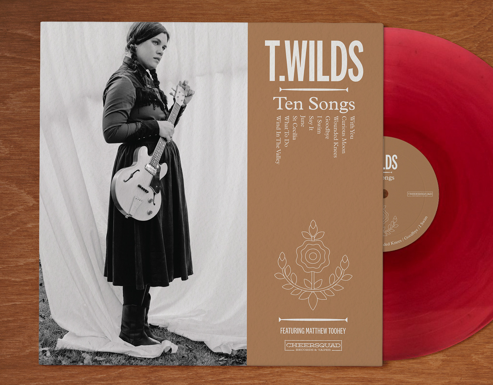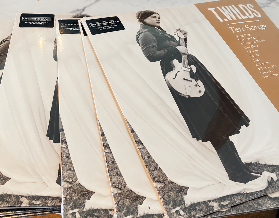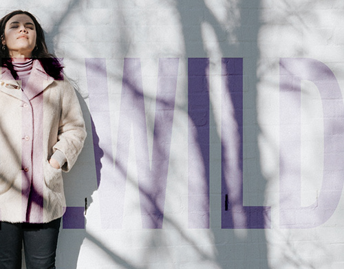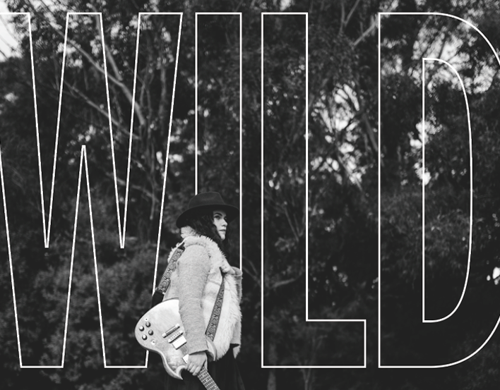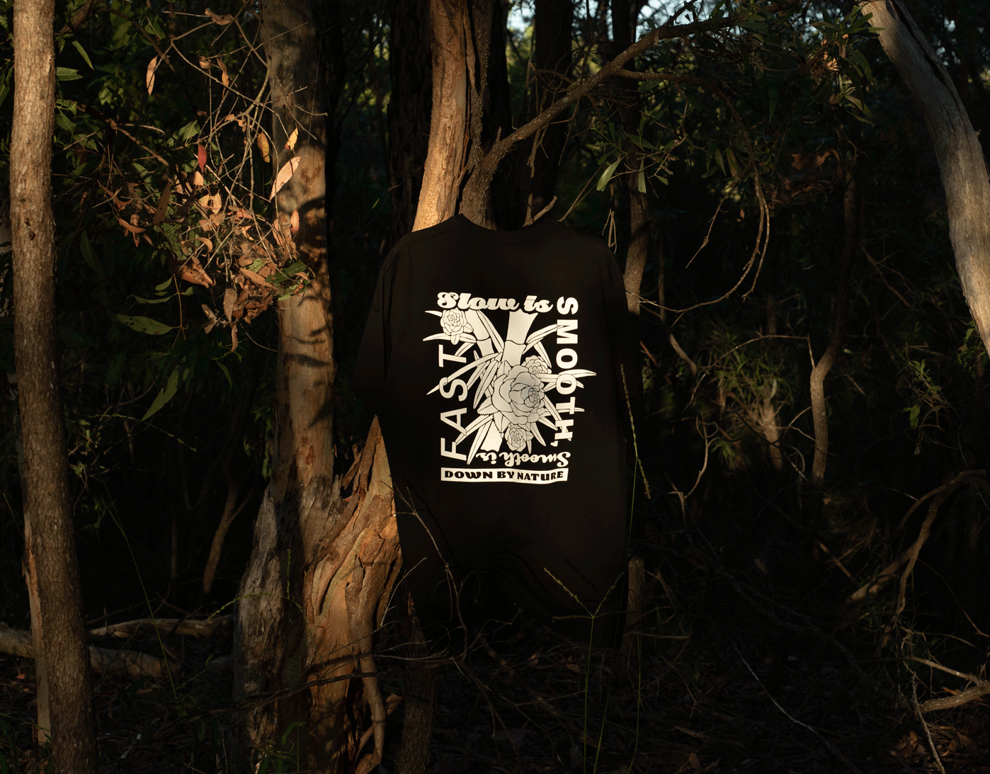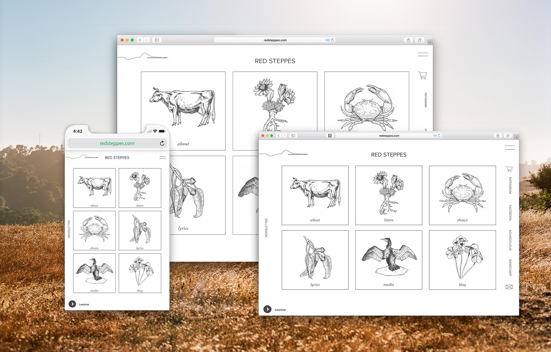
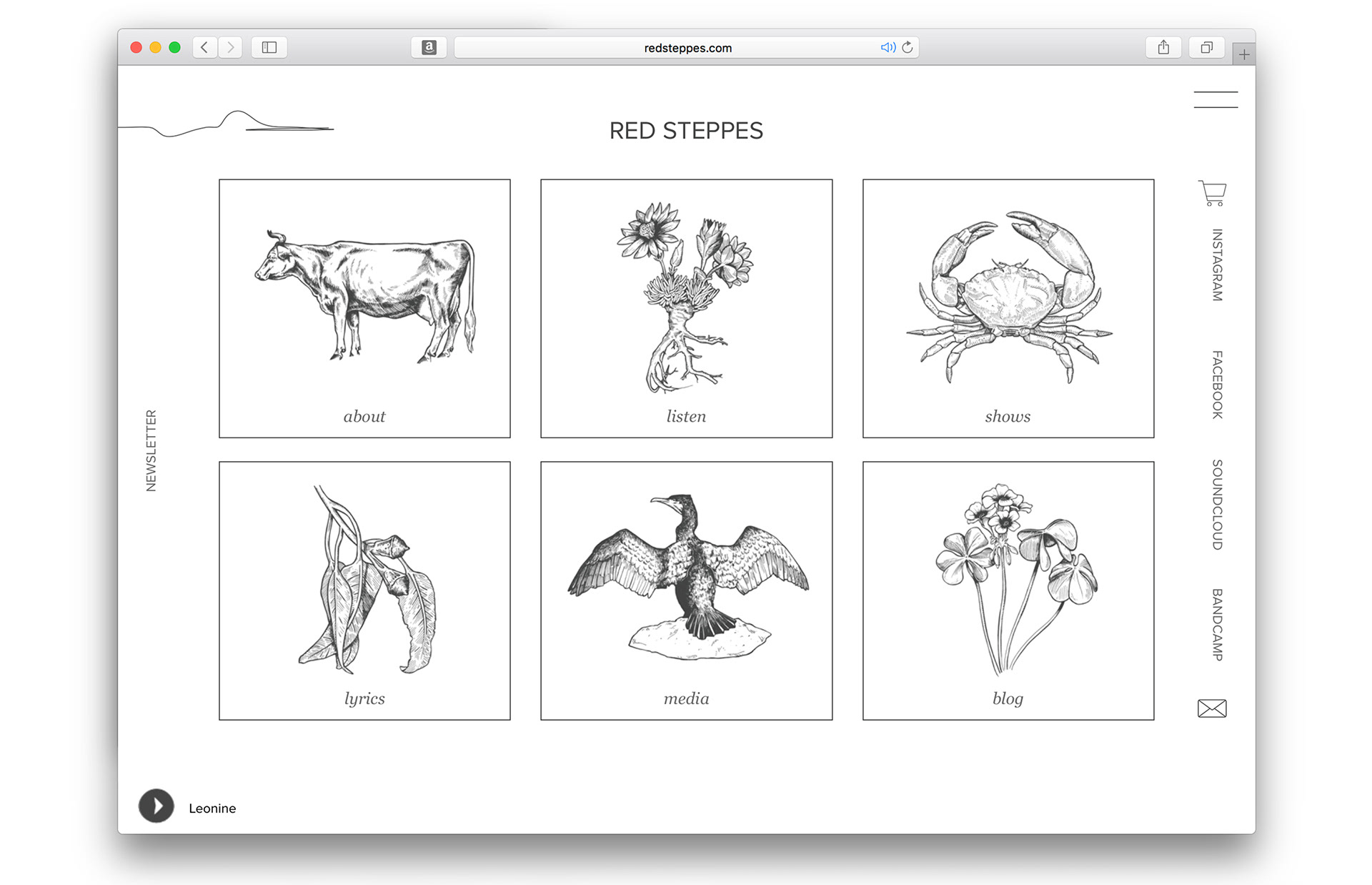
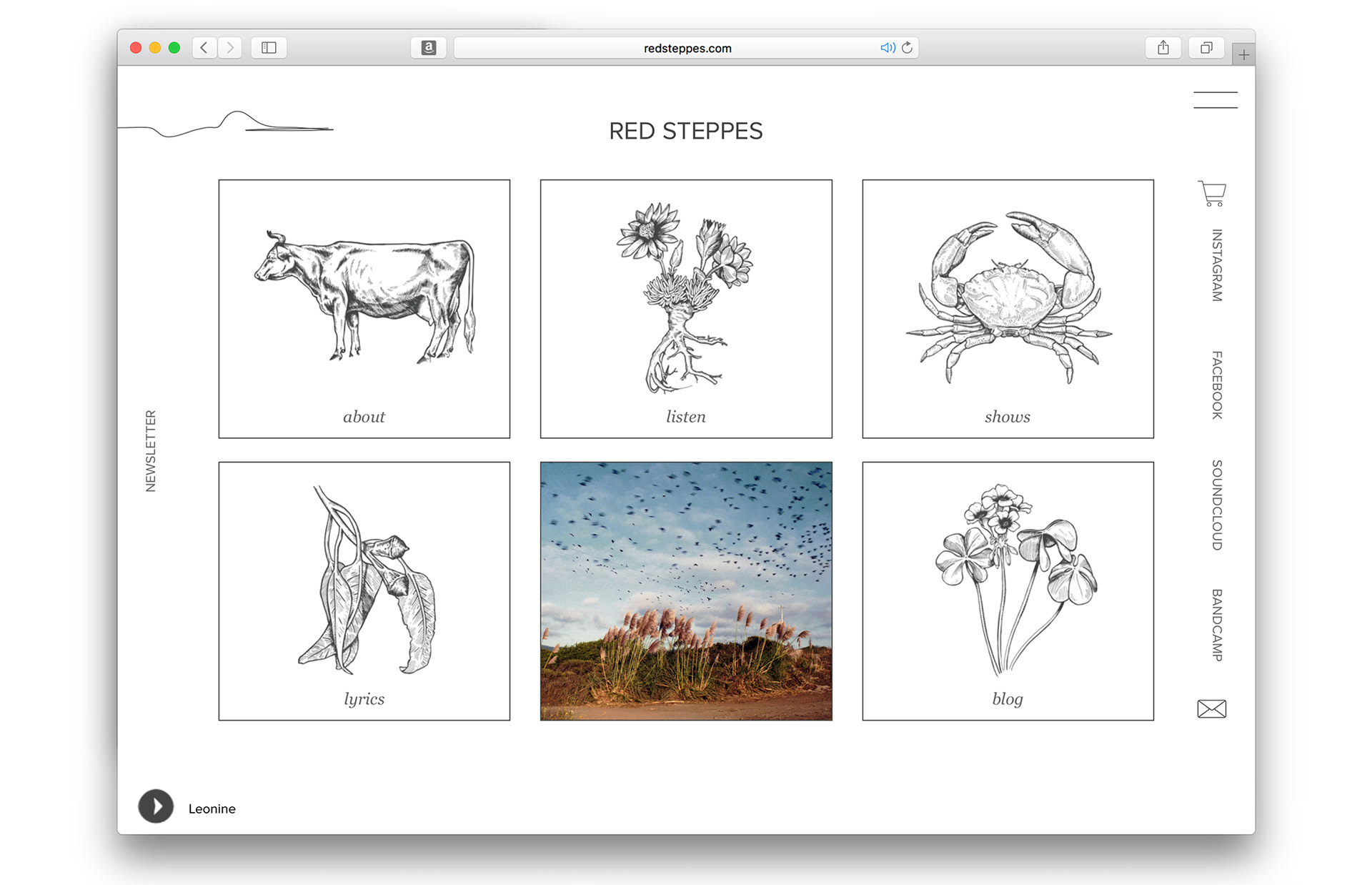
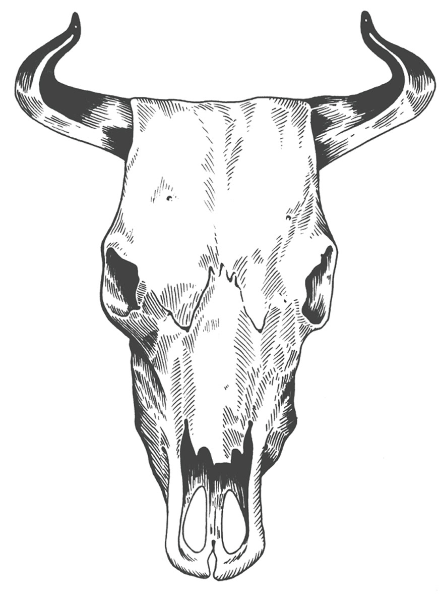
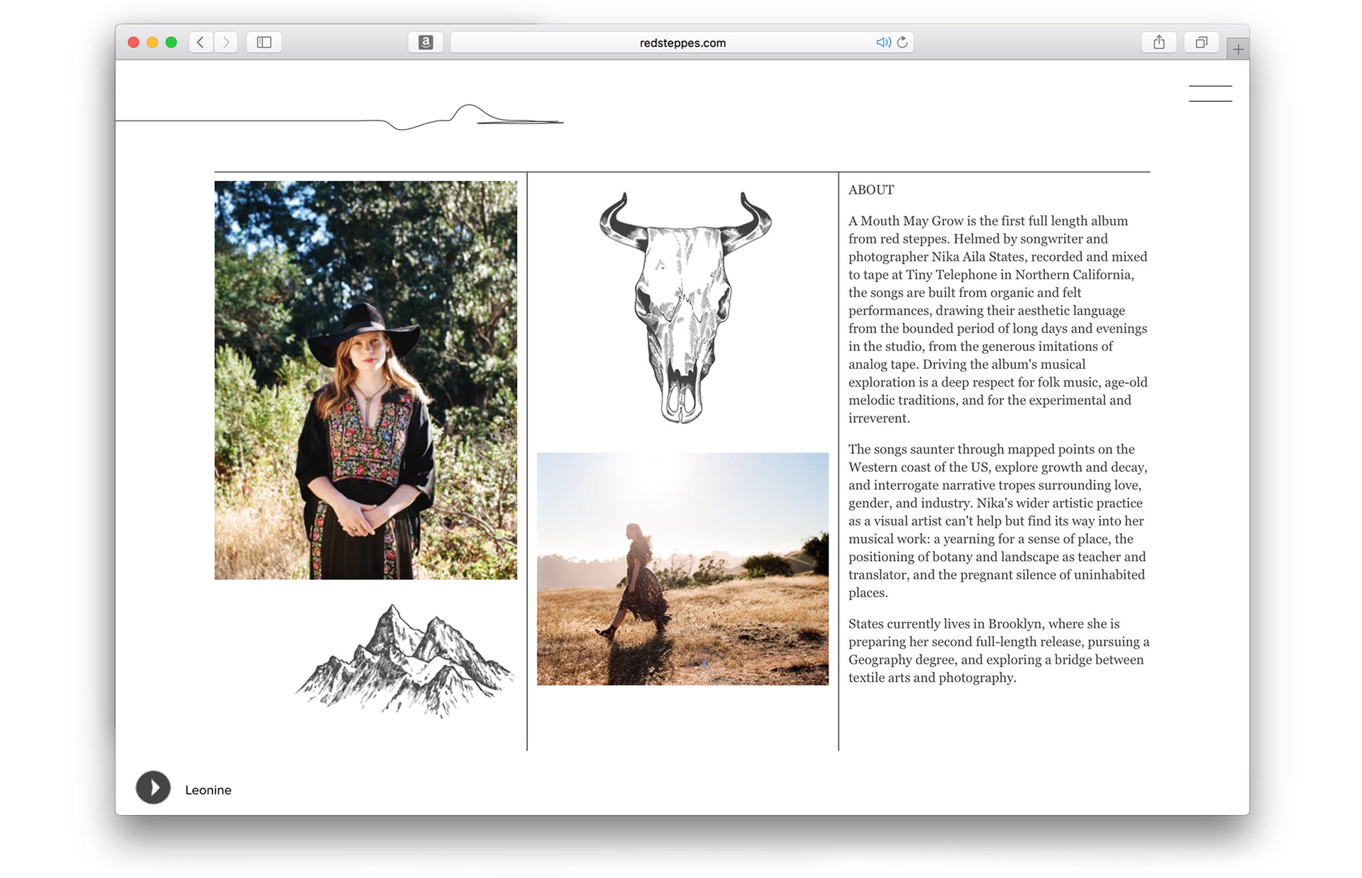
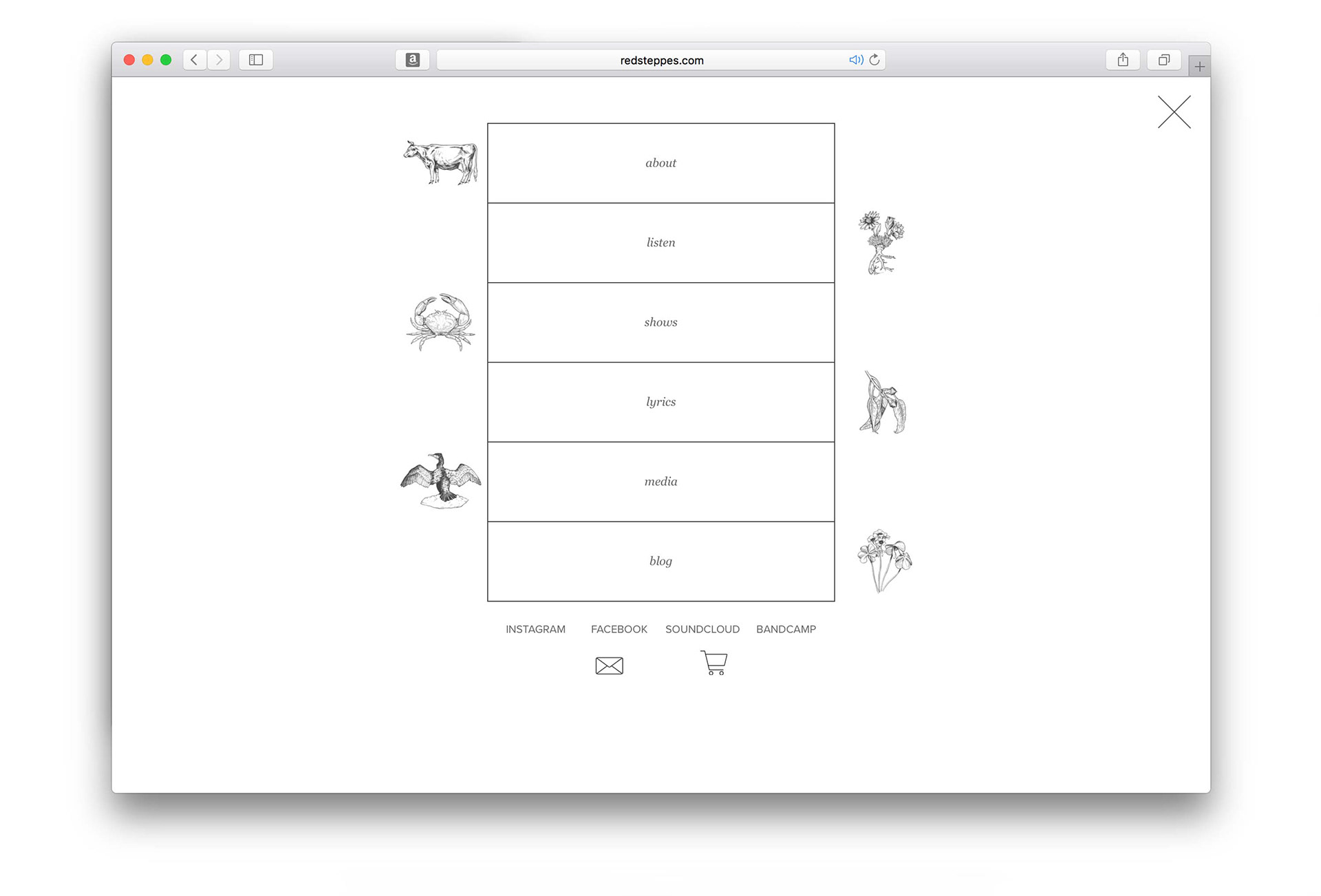
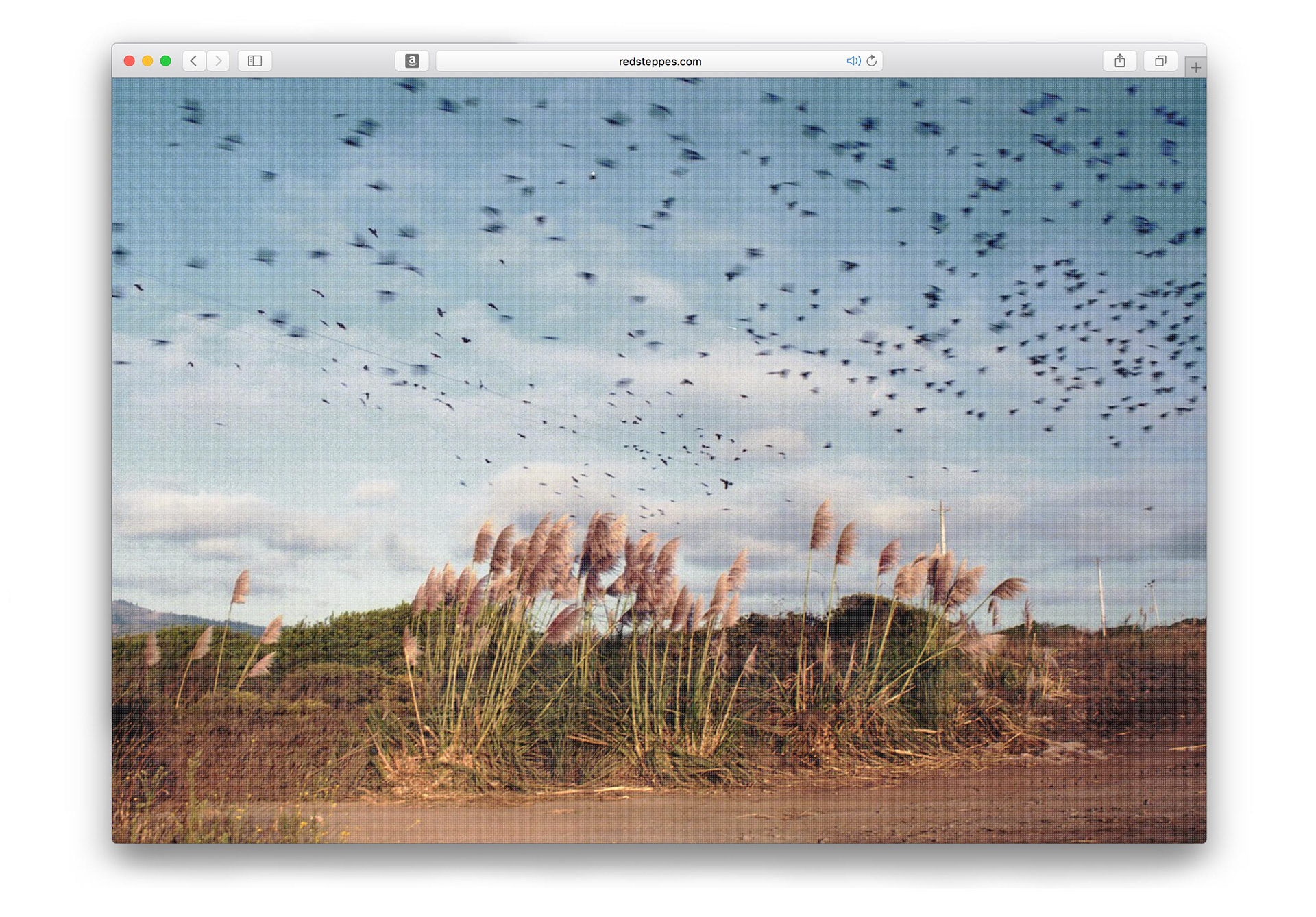
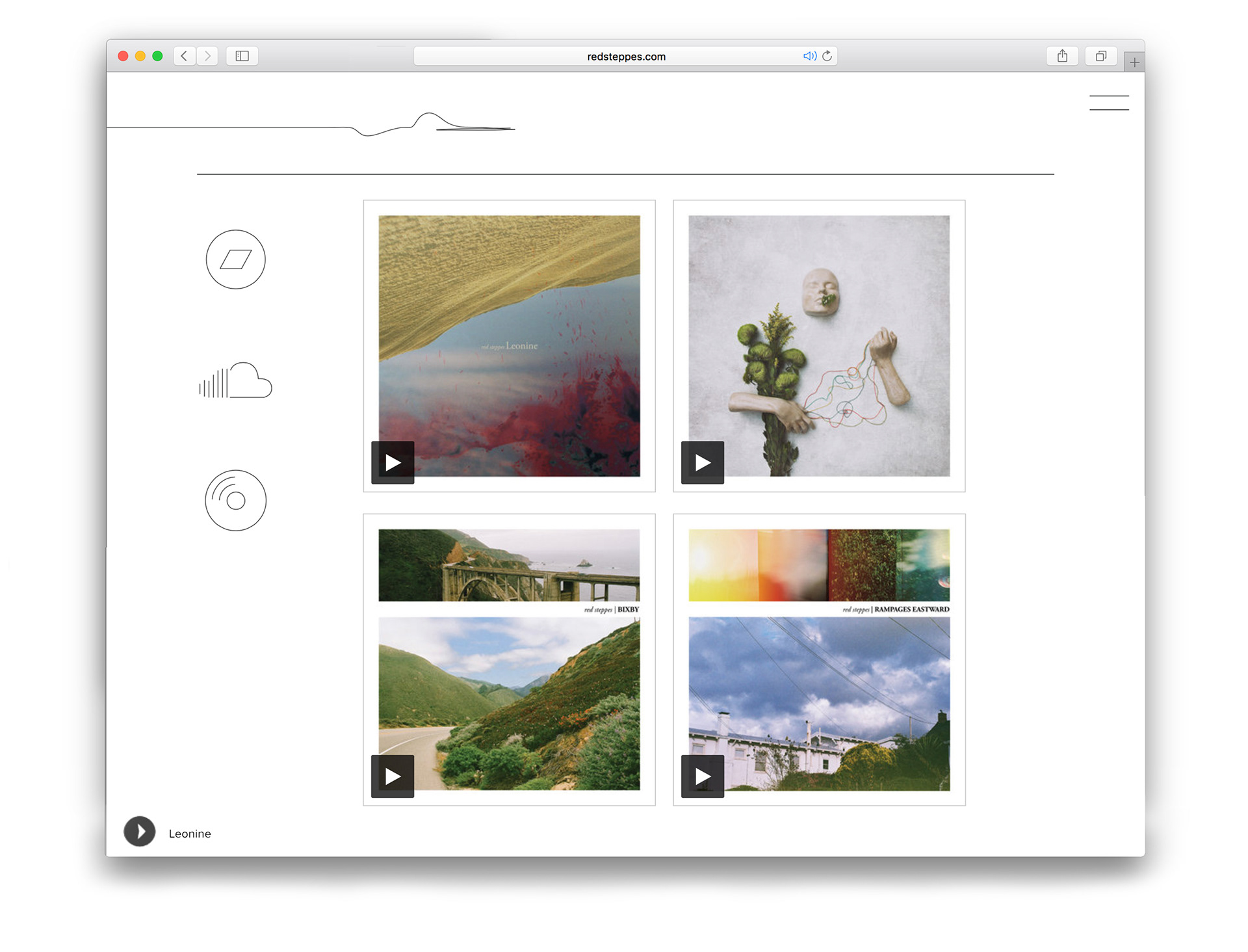
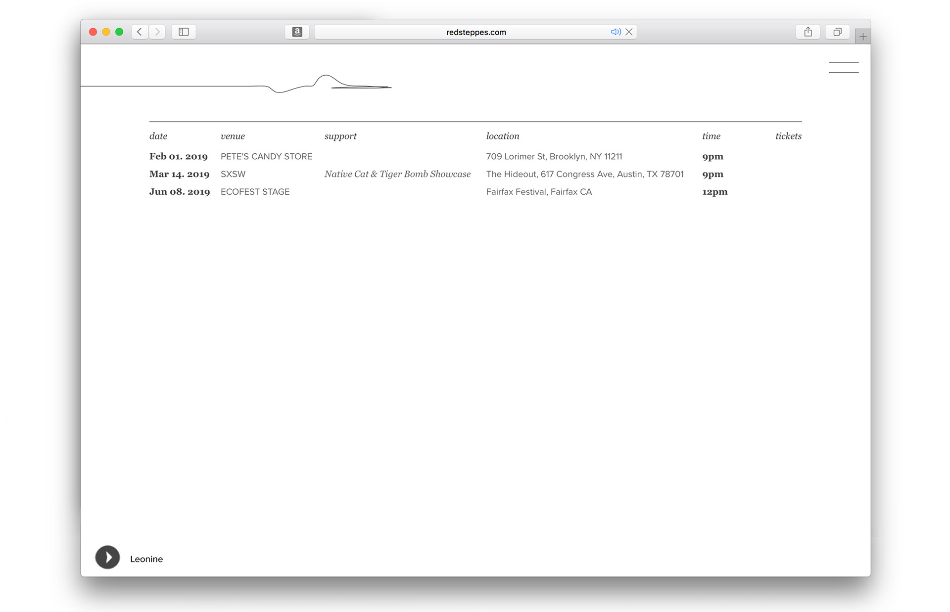
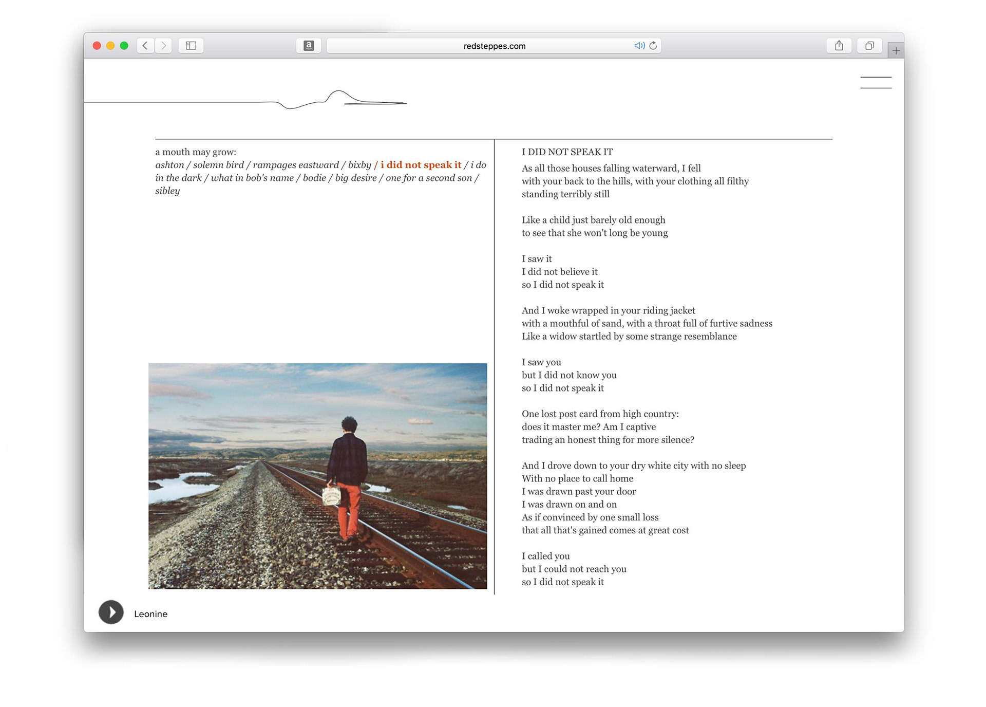
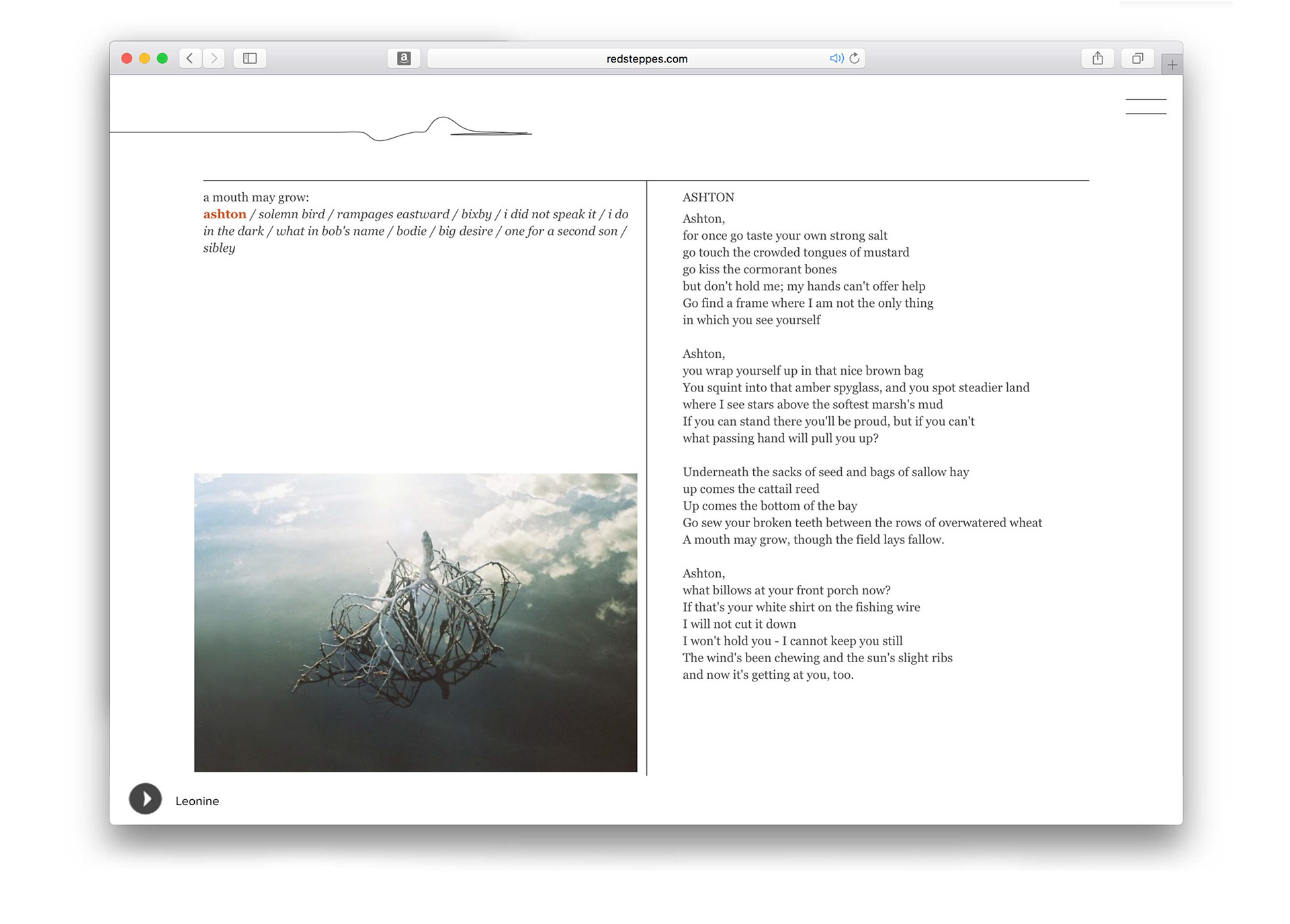
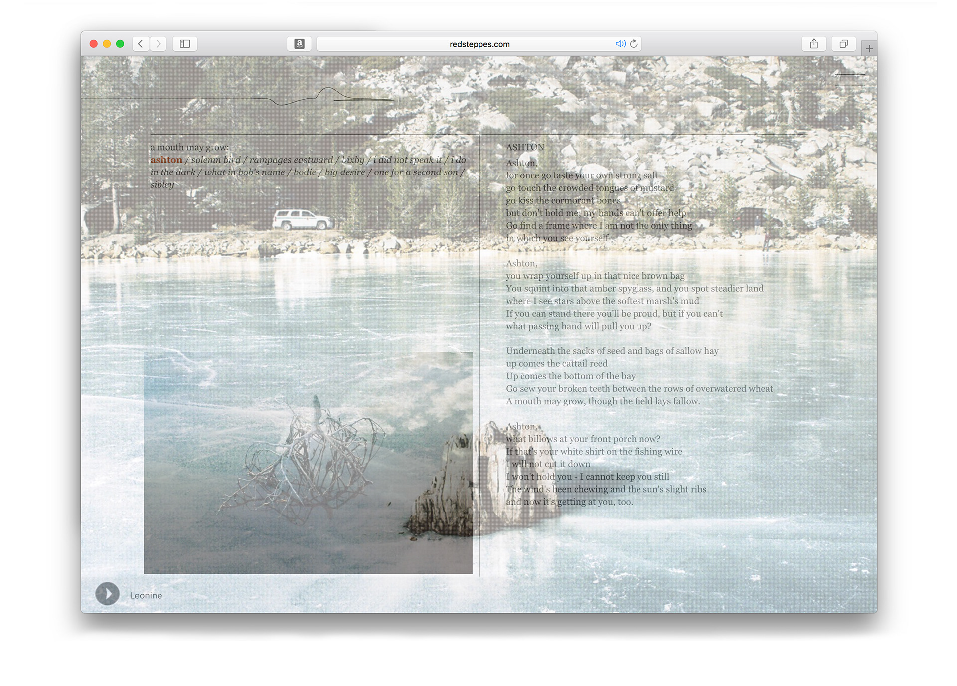
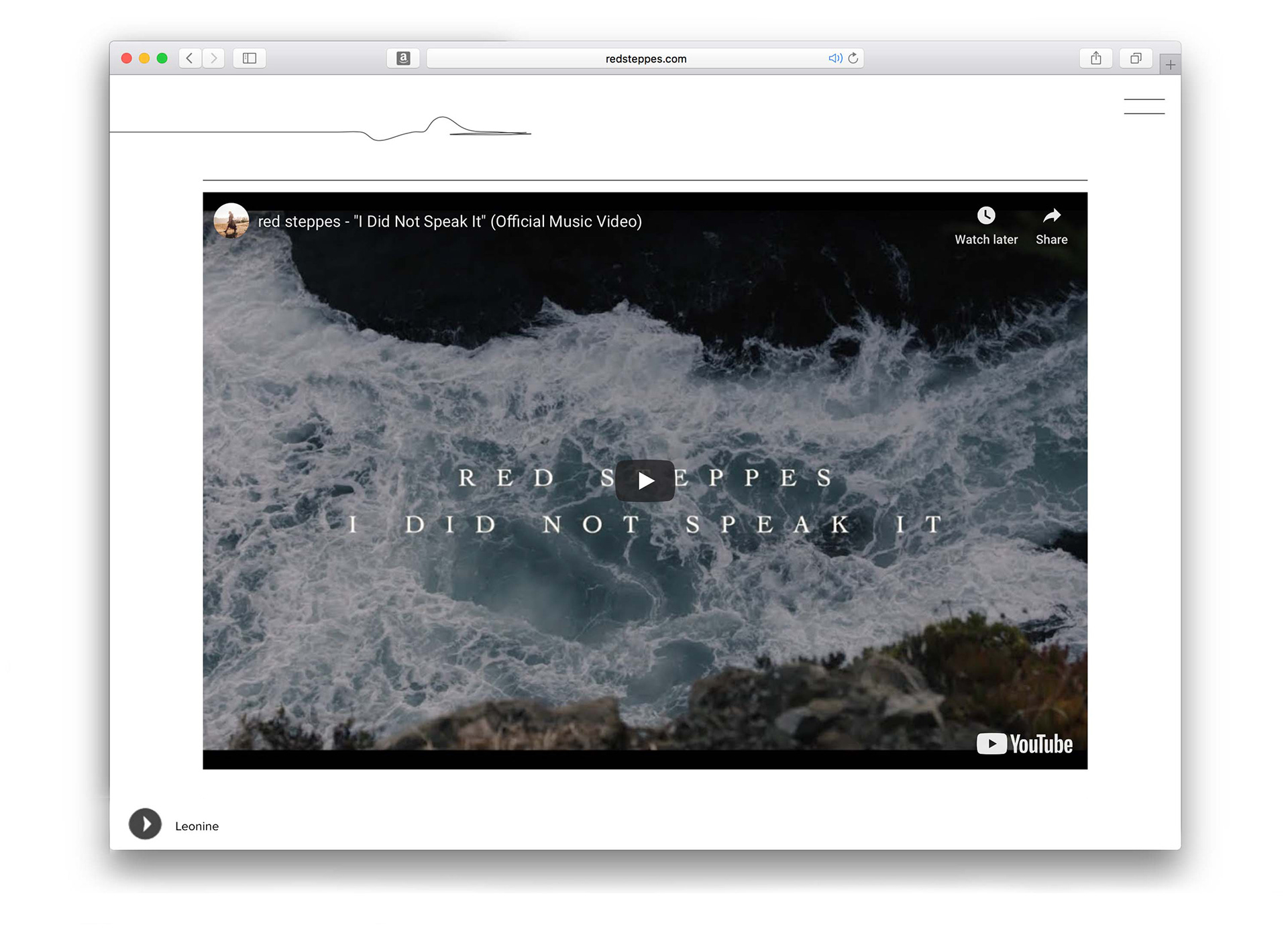
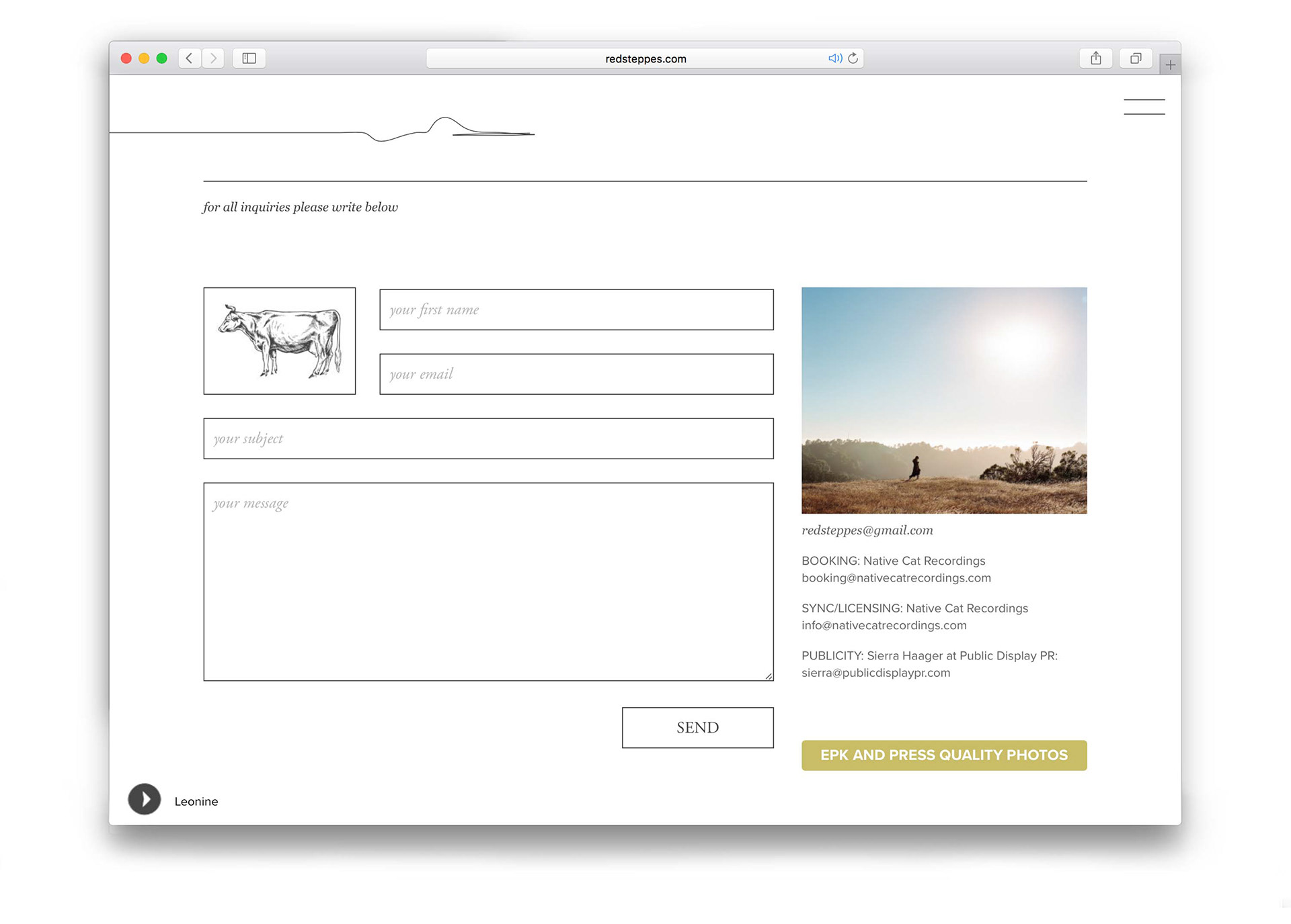
The brief for this website was pure minimalism. Going against the often busy visual language of musician websites, I created a pared-back, gridded site that gave Nika’s achingly beautiful songs and lyrics space to sing. The sparseness also created a gallery-like setting for Nika’s sweeping 35mm landscape photography. The images appeared on hover over menu items and full screen between page transitions, allowing the landscape to become part of the experience without competing with the music. Nika had initially requested detailed engraver-style illustrations to use as button icons. Their intricacy felt too beautiful — and too detailed — to reduce to functional icons, so I incorporated them into the grid instead, giving the site an almost book-like quality. The subjects were drawn from elements Nika identified as recurring inspirations in her songwriting. I commissioned Aaron Hill to create the custom illustrations. His finely drawn, single-colour work brought a human quality to the minimal structure while retaining the sense of sparseness I wanted throughout the site. The illustrations sit somewhere between feature and backdrop. I wanted the experience to feel quiet and unrushed: to land on the homepage, hear Nika’s music begin, and explore the songs, words, photographs and imagery of her world without the constant movement and quick-scroll behaviour of much of the web