

IDENTITY
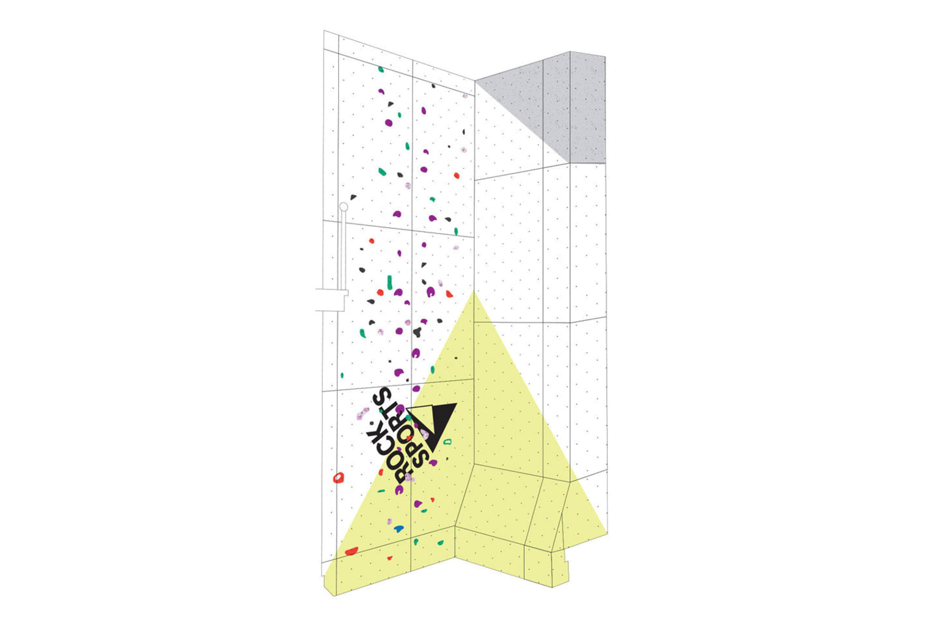
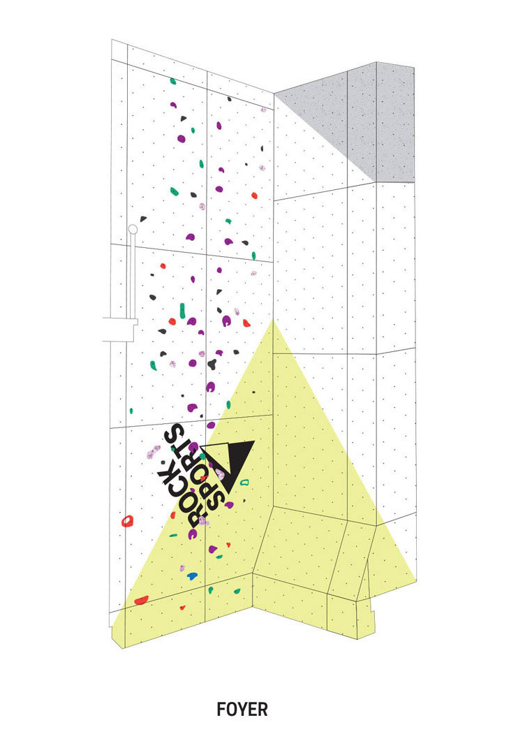
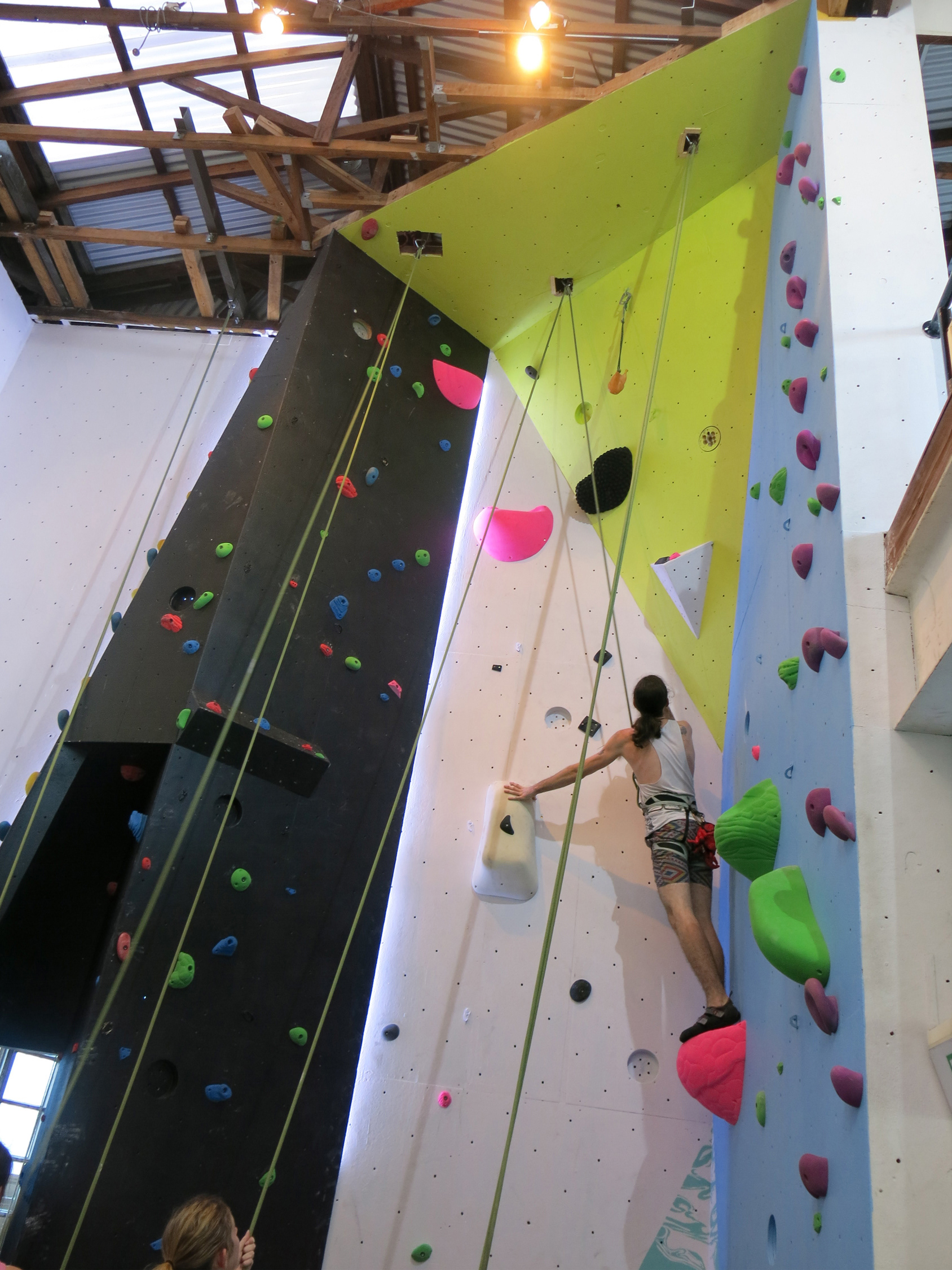
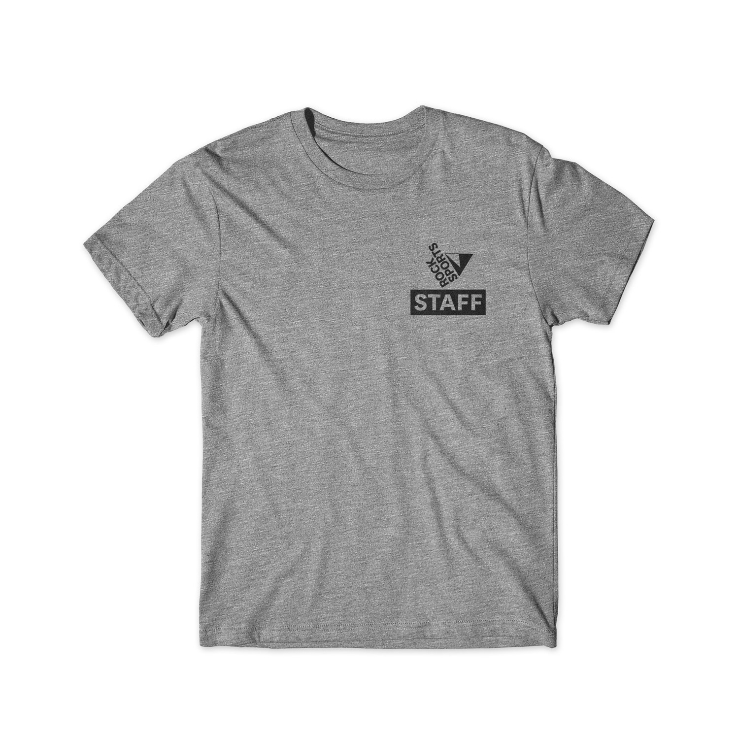
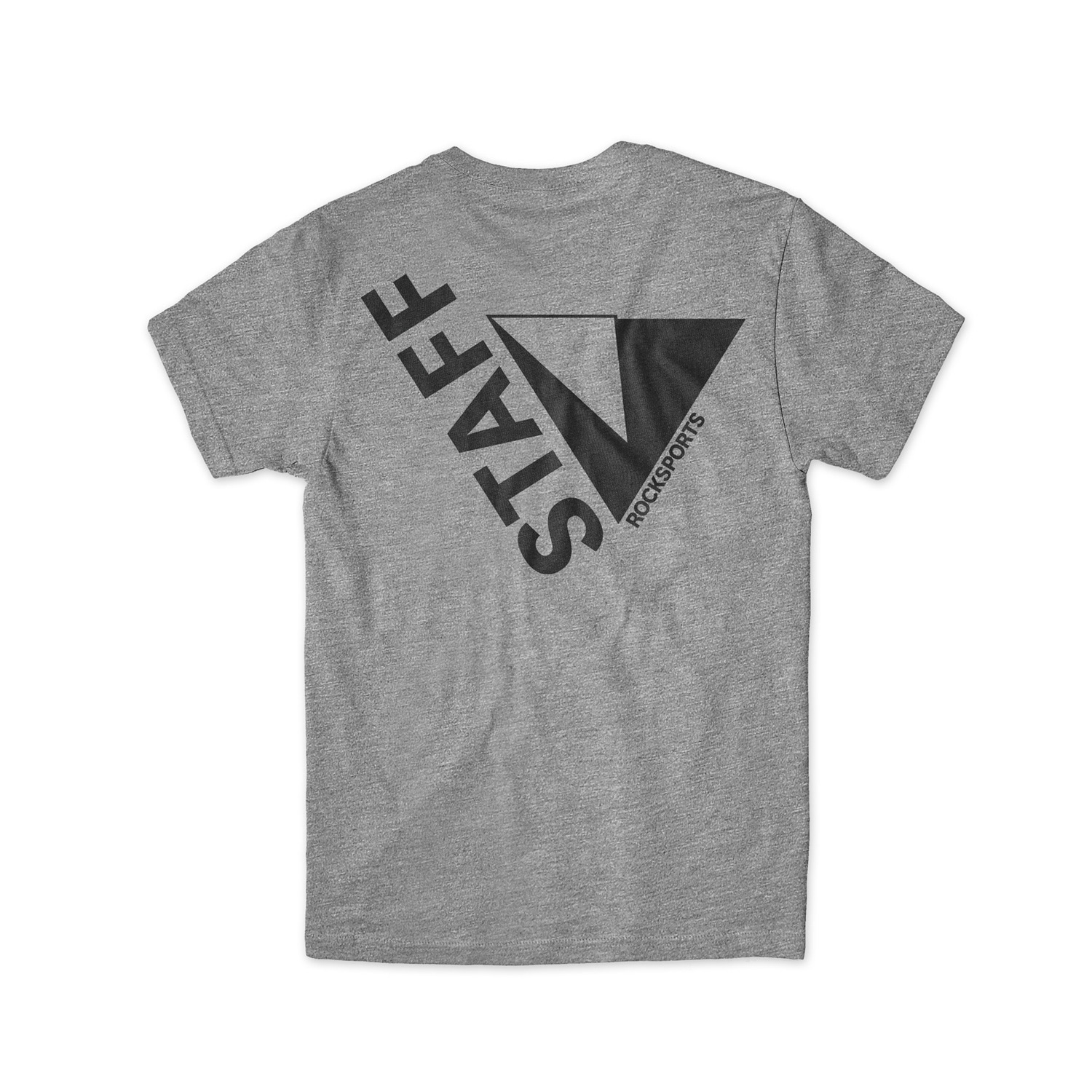
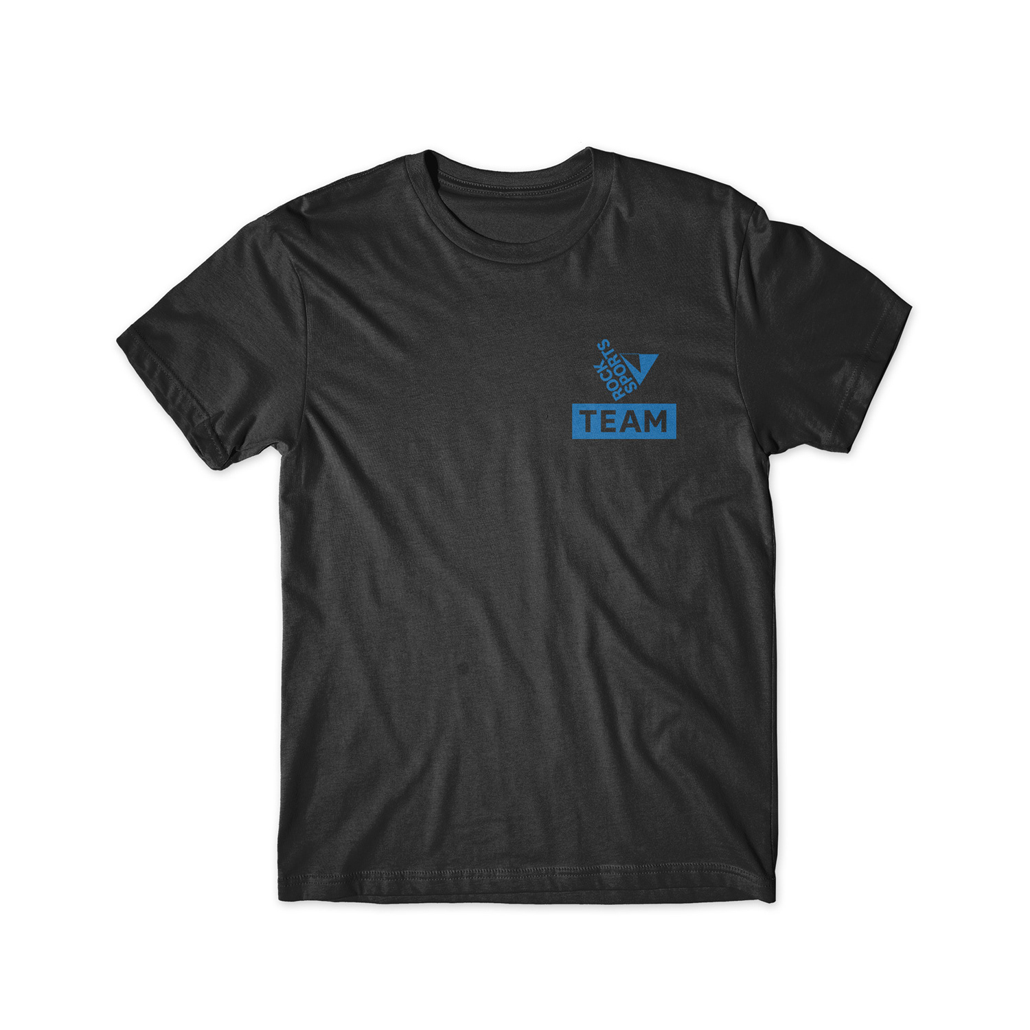
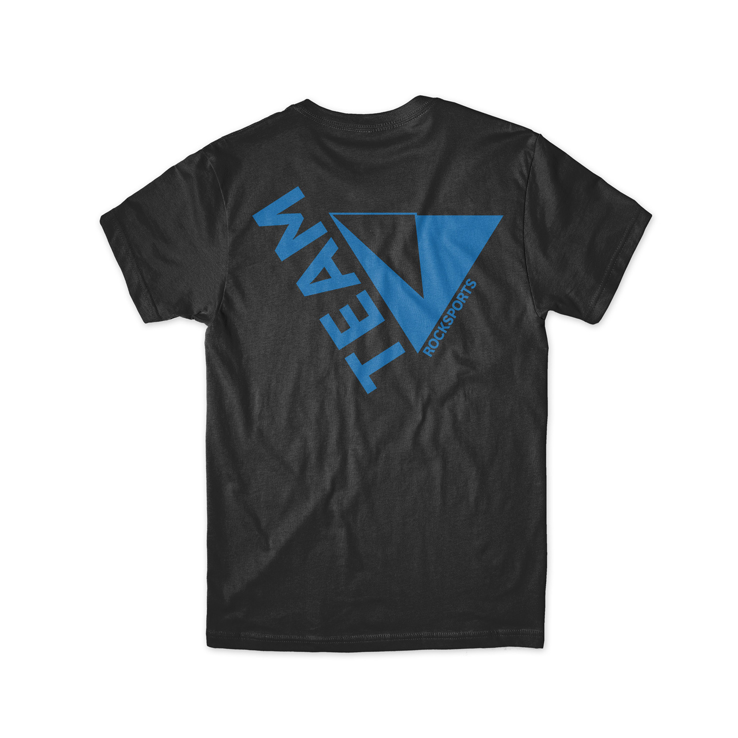
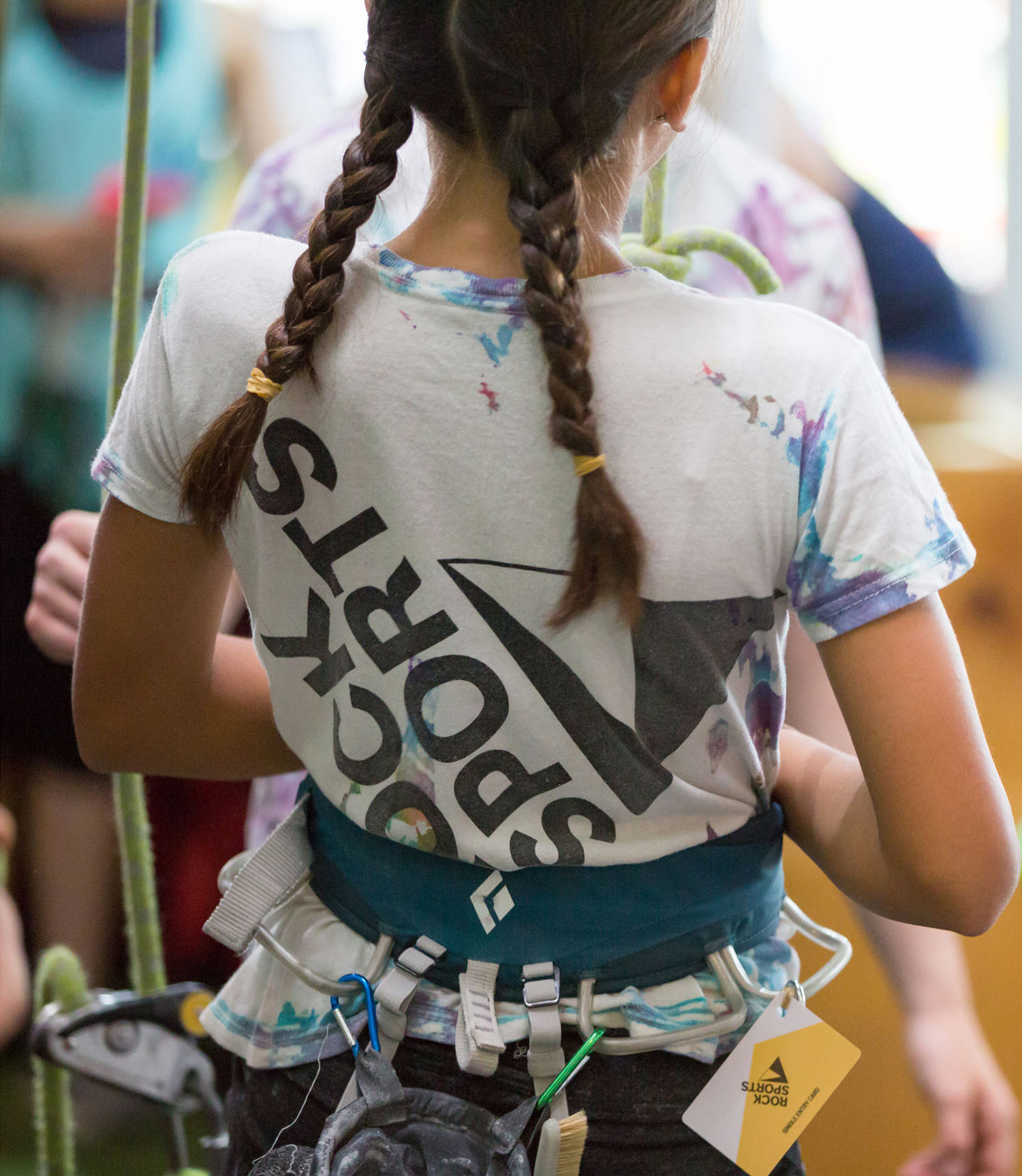
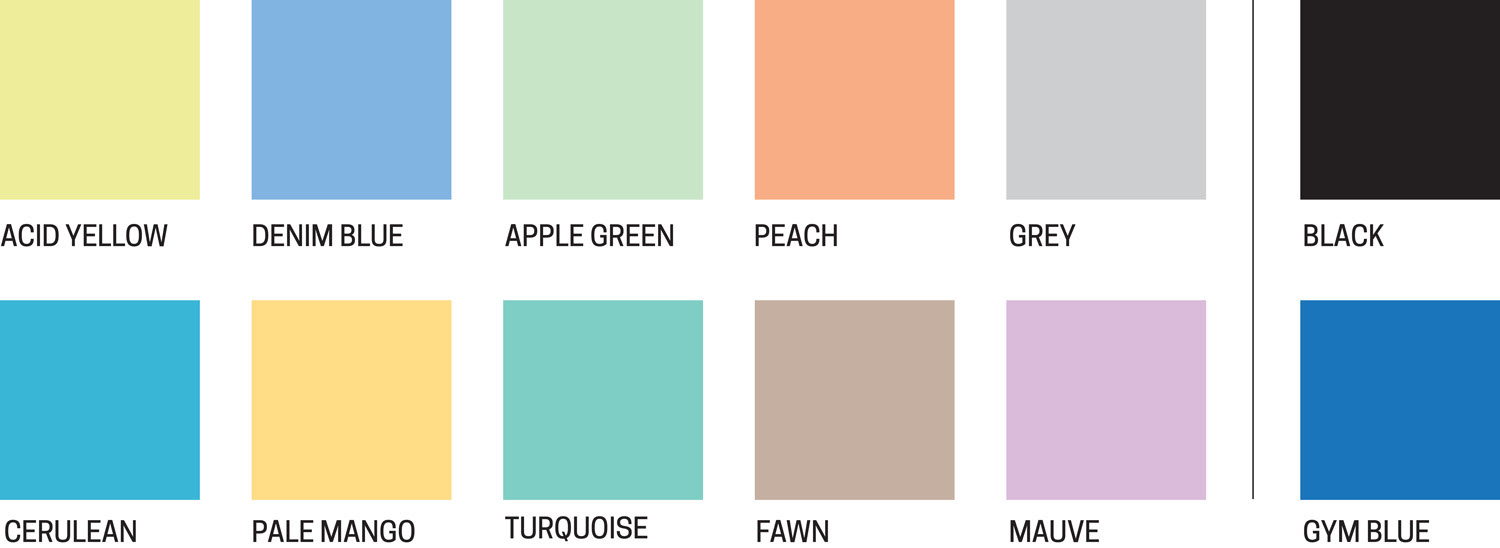
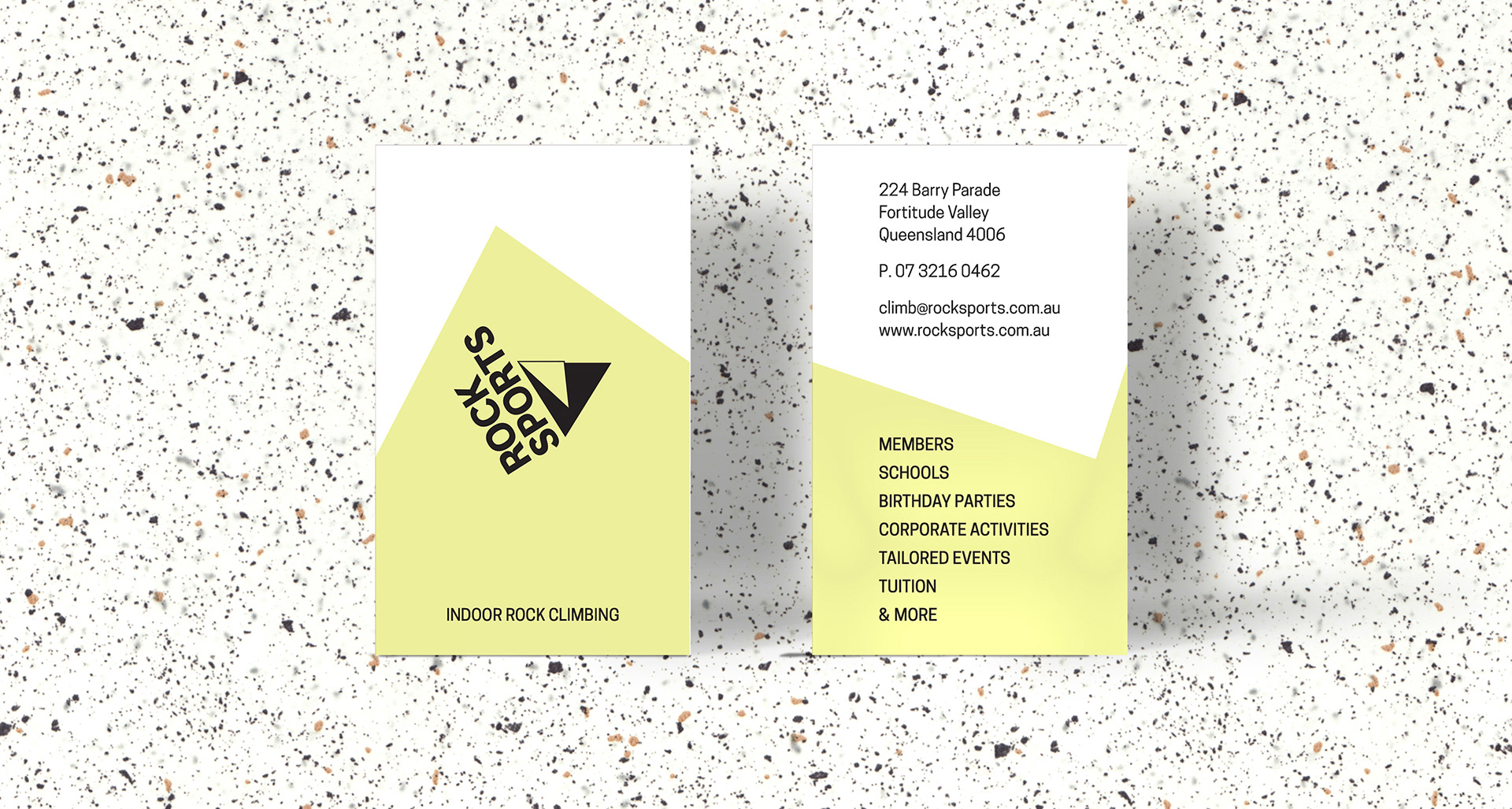
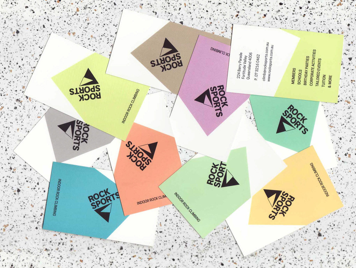
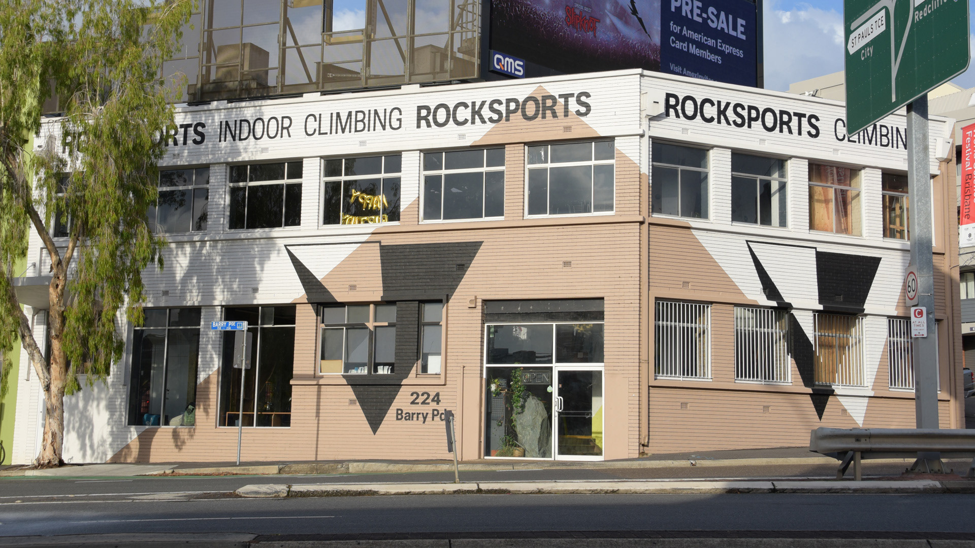
The new identity drew directly from the geometry of the indoor climbing environment. Angular climbing walls, the movement of a climber and the existing Rocksports name were brought together to create a compact, energetic mark. The identity was designed as a flexible system, able to shift in scale, orientation and colour across the space, signage, print and apparel.
ENVIRONMENT + PATTERN
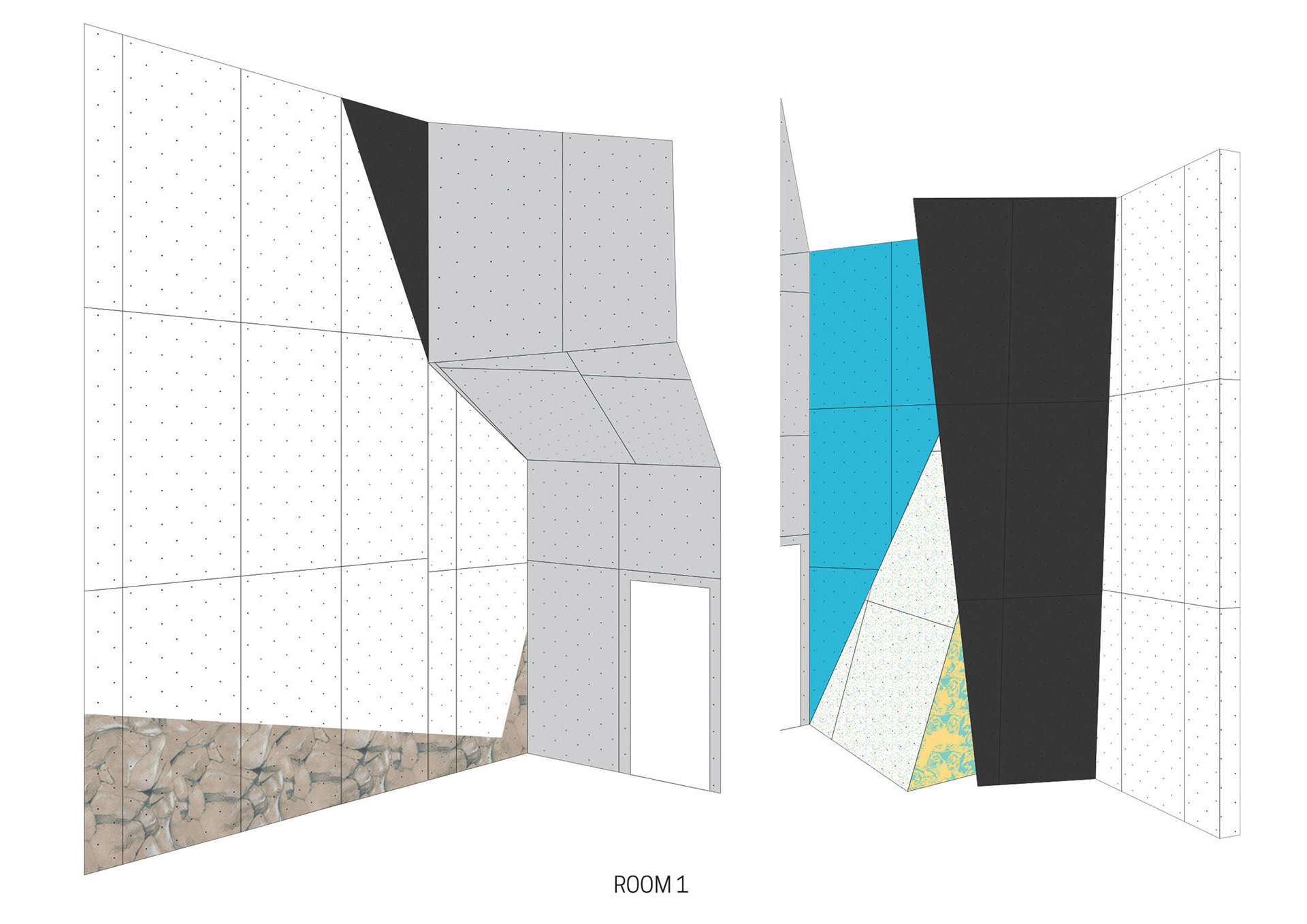
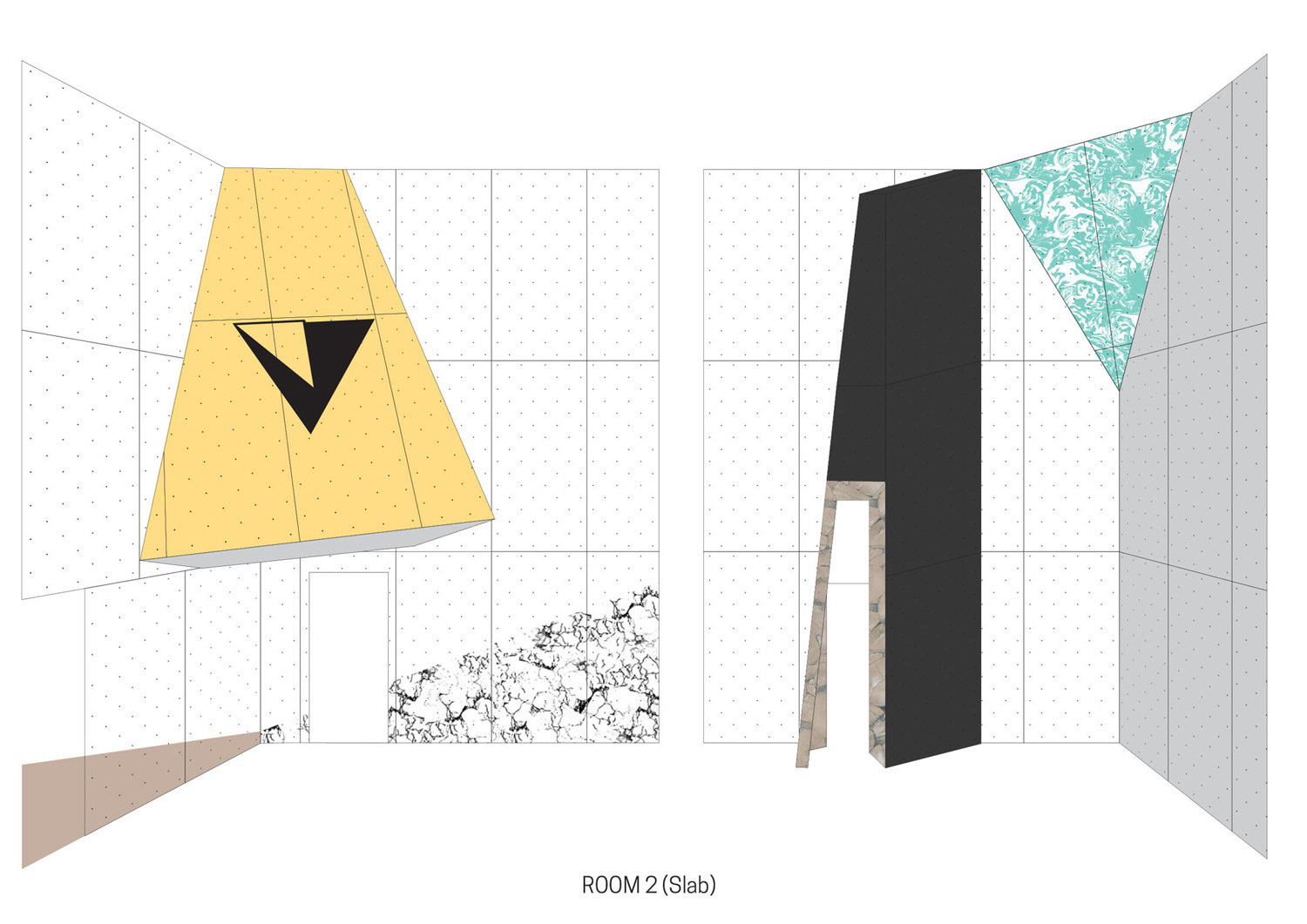
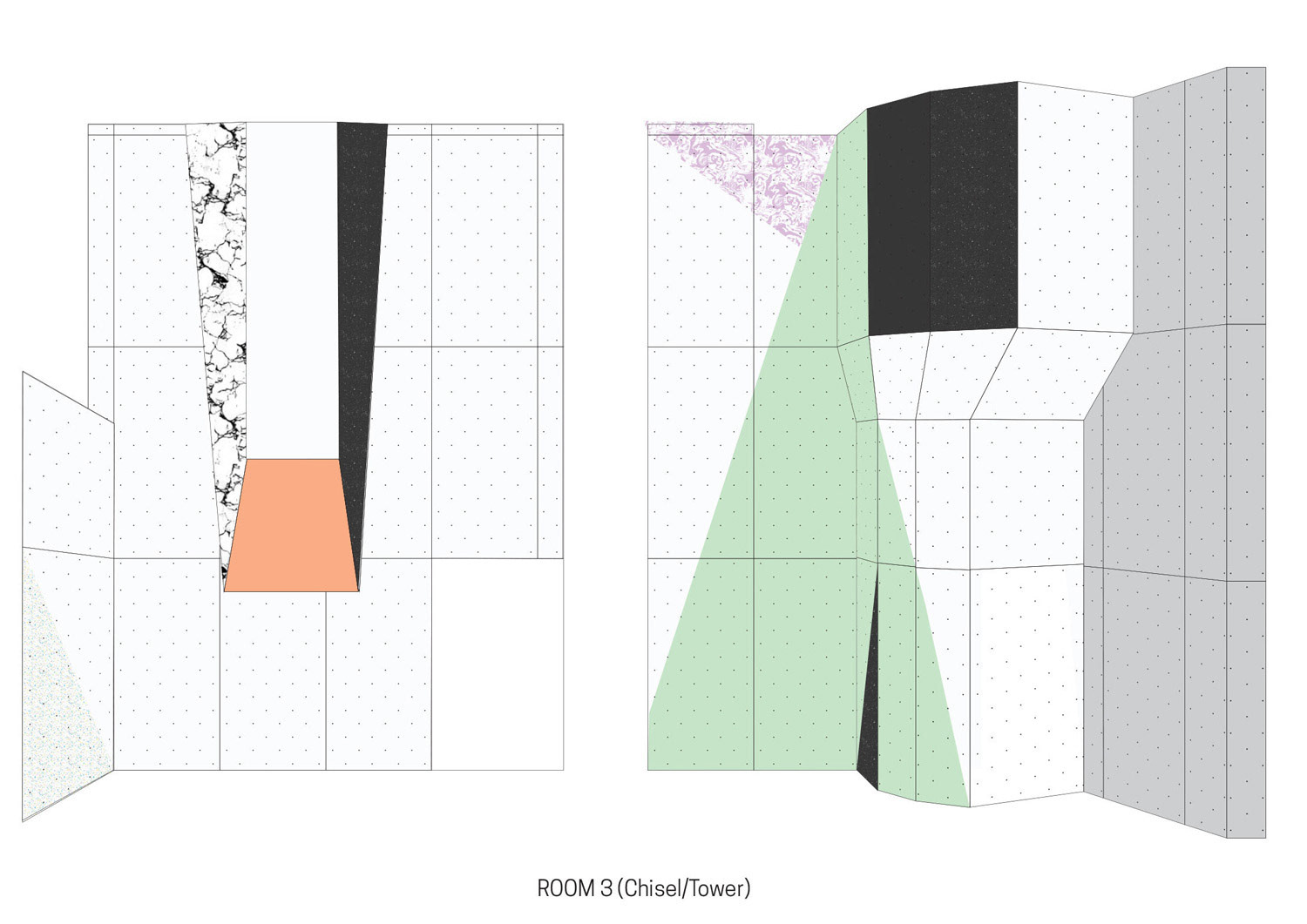
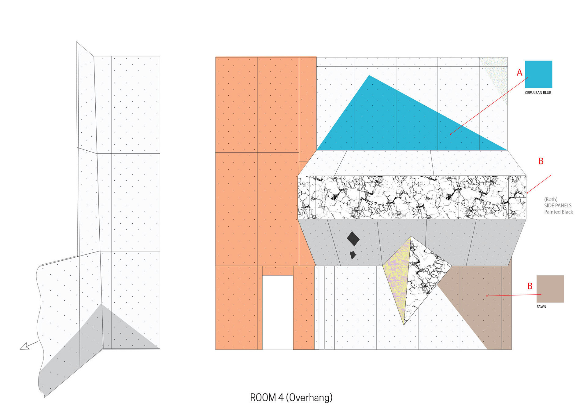
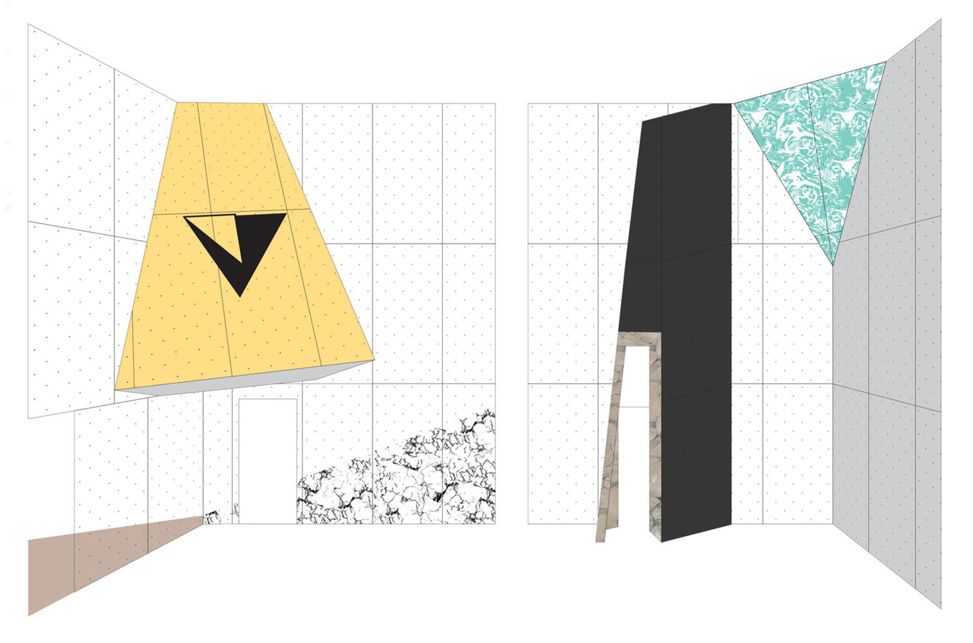
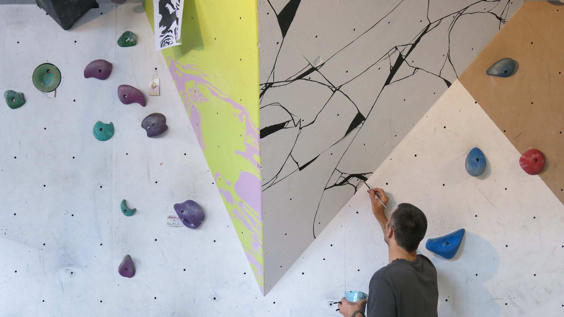
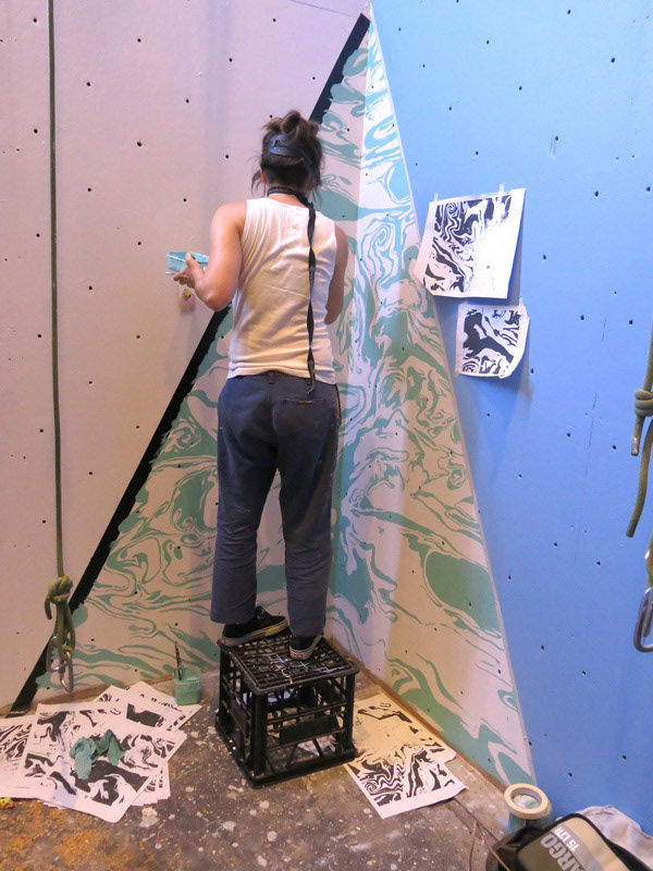
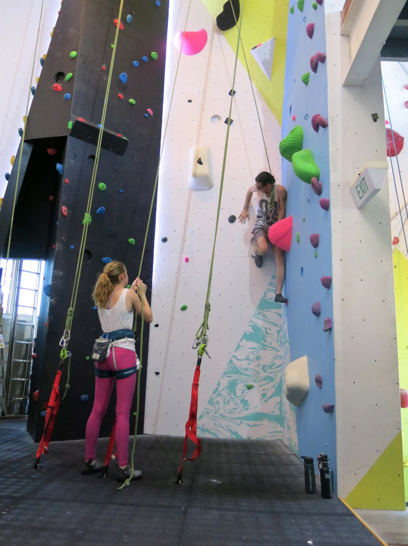
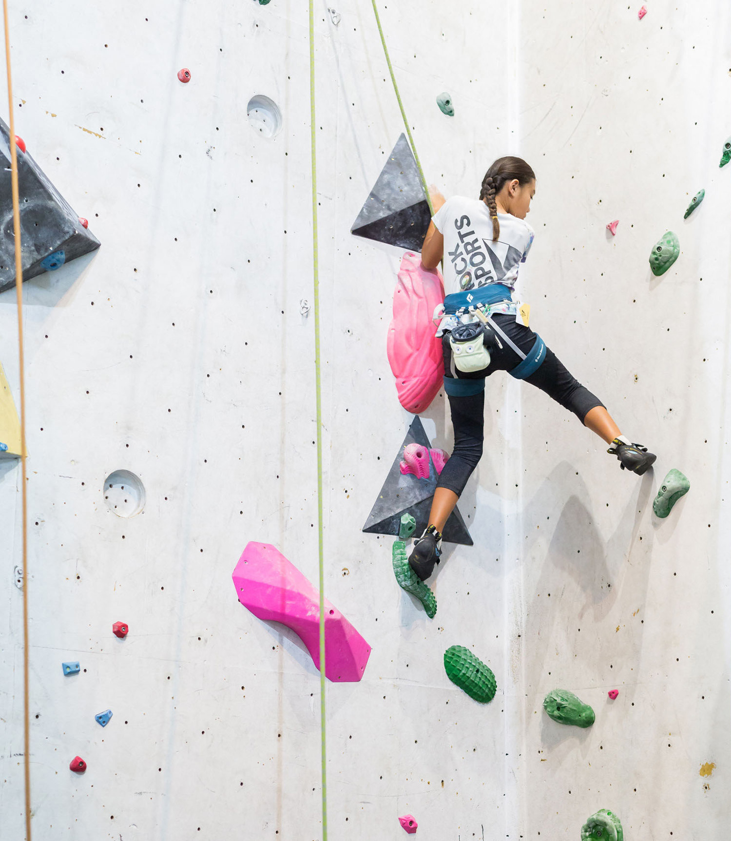
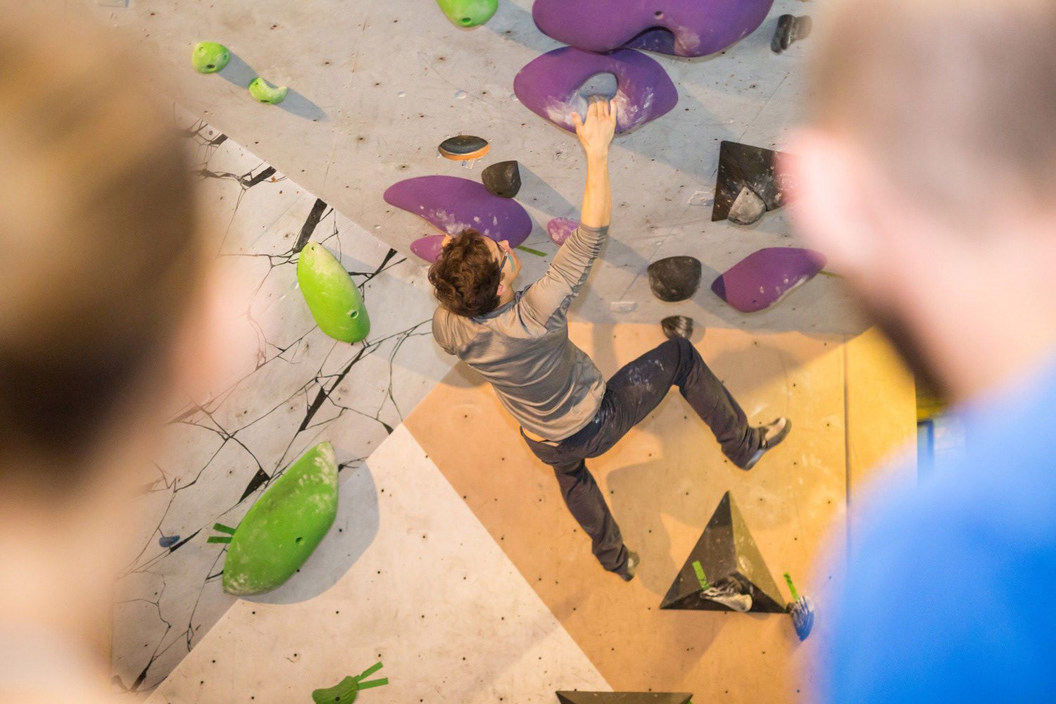
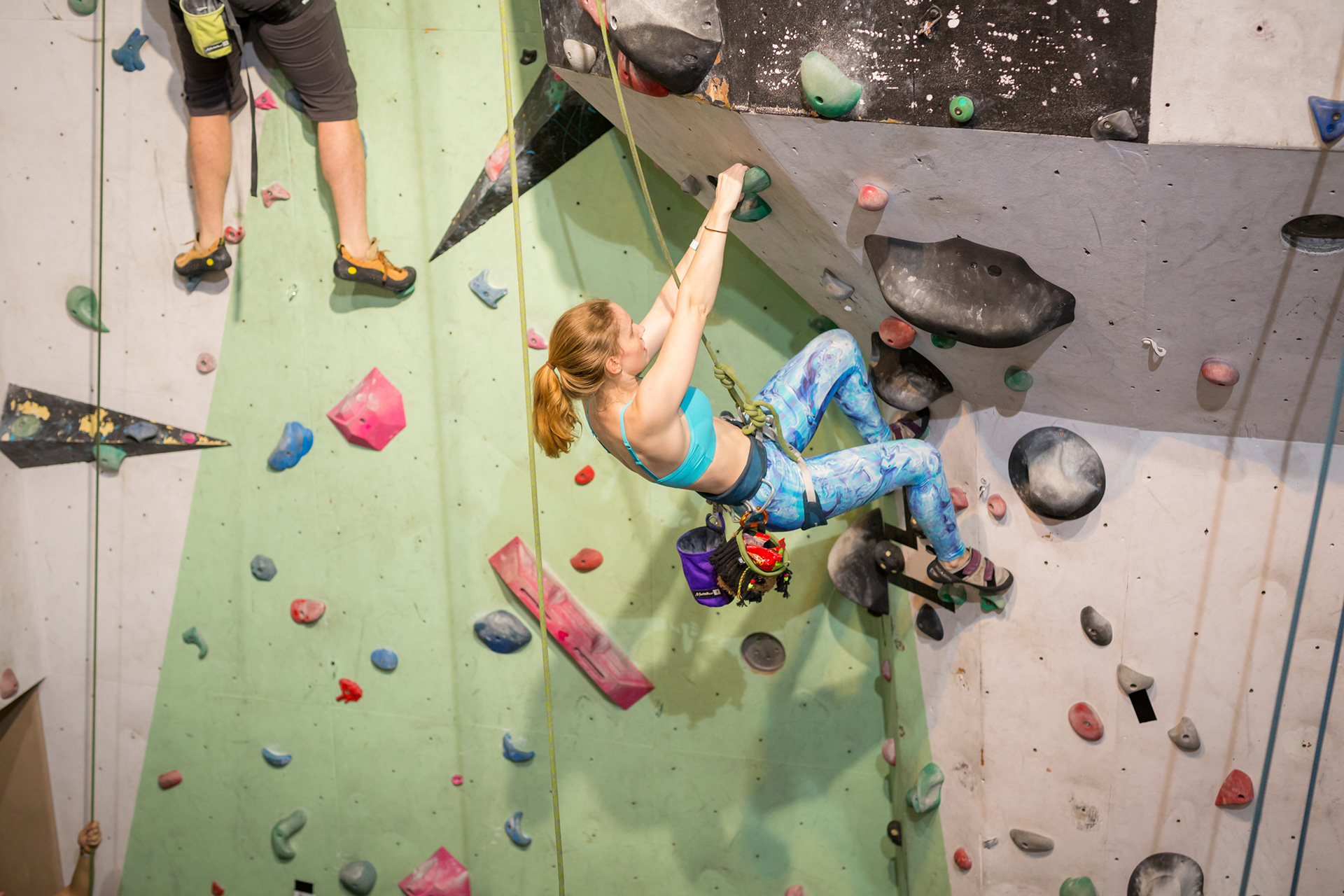
The vivid scatter of climbing holds became part of the visual inspiration for the space. Their irregular colour and rhythm informed a family of patterns and graphic interventions, drawing loosely on the expressive visual language of 1980s climbing and outdoor sports — geometric colour blocking, marbled surfaces and hand-rendered pattern.
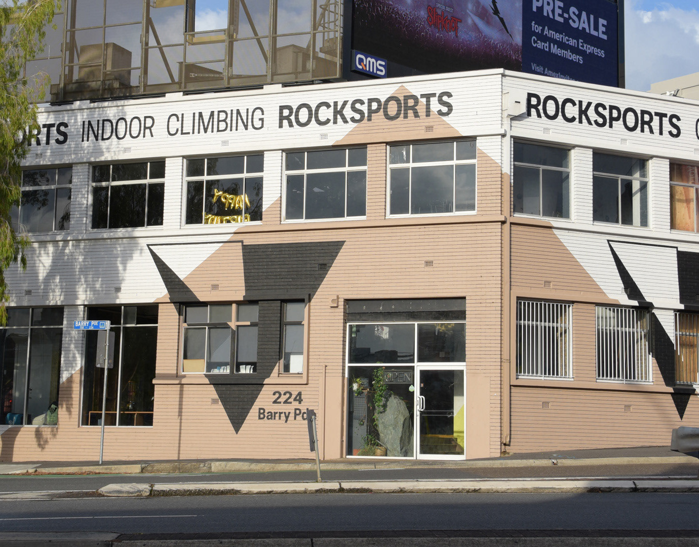
These elements were carried into the physical environment, with large areas of colour and pattern — including hand-painted sections — applied directly to the climbing walls. The identity extended across the building façade, interior, apparel and printed collateral, creating a cohesive visual language throughout the gym.